A fintech identity system designed to feel clear, distinct and usable.
BarakaPay is presented through an identity system built around its distinctive looped symbol, a blue-and-gold palette, supporting typography and practical applications across digital and business touchpoints.
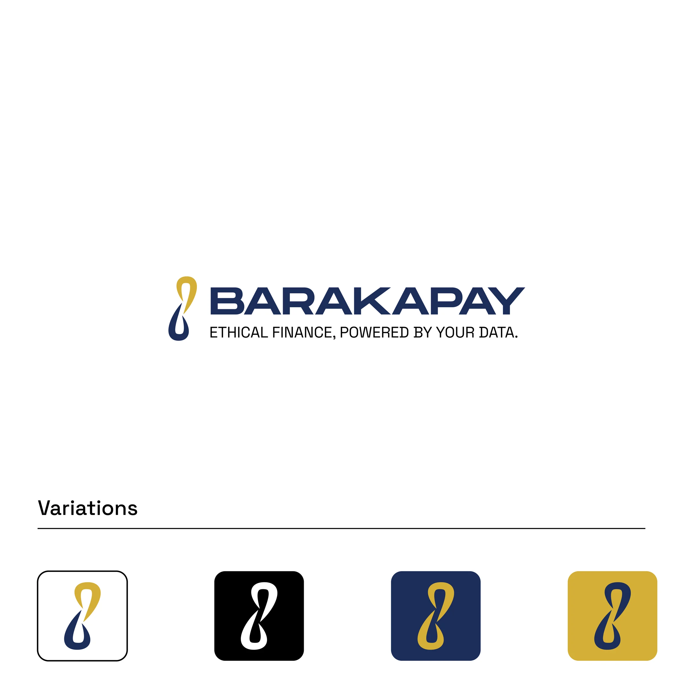
One symbol, multiple expressions.
The identity centres on a looped symbol that carries through the wordmark, standalone icon and application system. The supplied brand board shows the mark working across white, black, navy and gold backgrounds.
The accompanying line — “Ethical finance, powered by your data.” — establishes the brand proposition alongside the core mark.
Blue, gold and neutral foundations.
The supplied guidelines define a primary Baraka Blue supported by white and Charcoal Black, with Gold as a secondary colour and Halal Green as a secondary accent.
Typography shown in the brand guide: Monument Extended for display work and Outfit for supporting text.
From the identity into real touchpoints.
The supplied work demonstrates the system across a mobile app presentation, social media layouts and business cards, with the full ten-page brand board documenting the wider system.


The brand board makes the identity repeatable.
The supplied ten-page brand document records the colours, typography, logo construction and usage examples behind the visual system. That documentation gives the identity a practical foundation for consistent rollout across digital and business contexts.
Open brand identity PDF ↗