LockAm — a visual identity built around discipline, trust, and long-term value.
A brand identity system for LockAm, presented as a full guideline covering the mark, supporting visual language, colour direction, typography, and real-world applications.
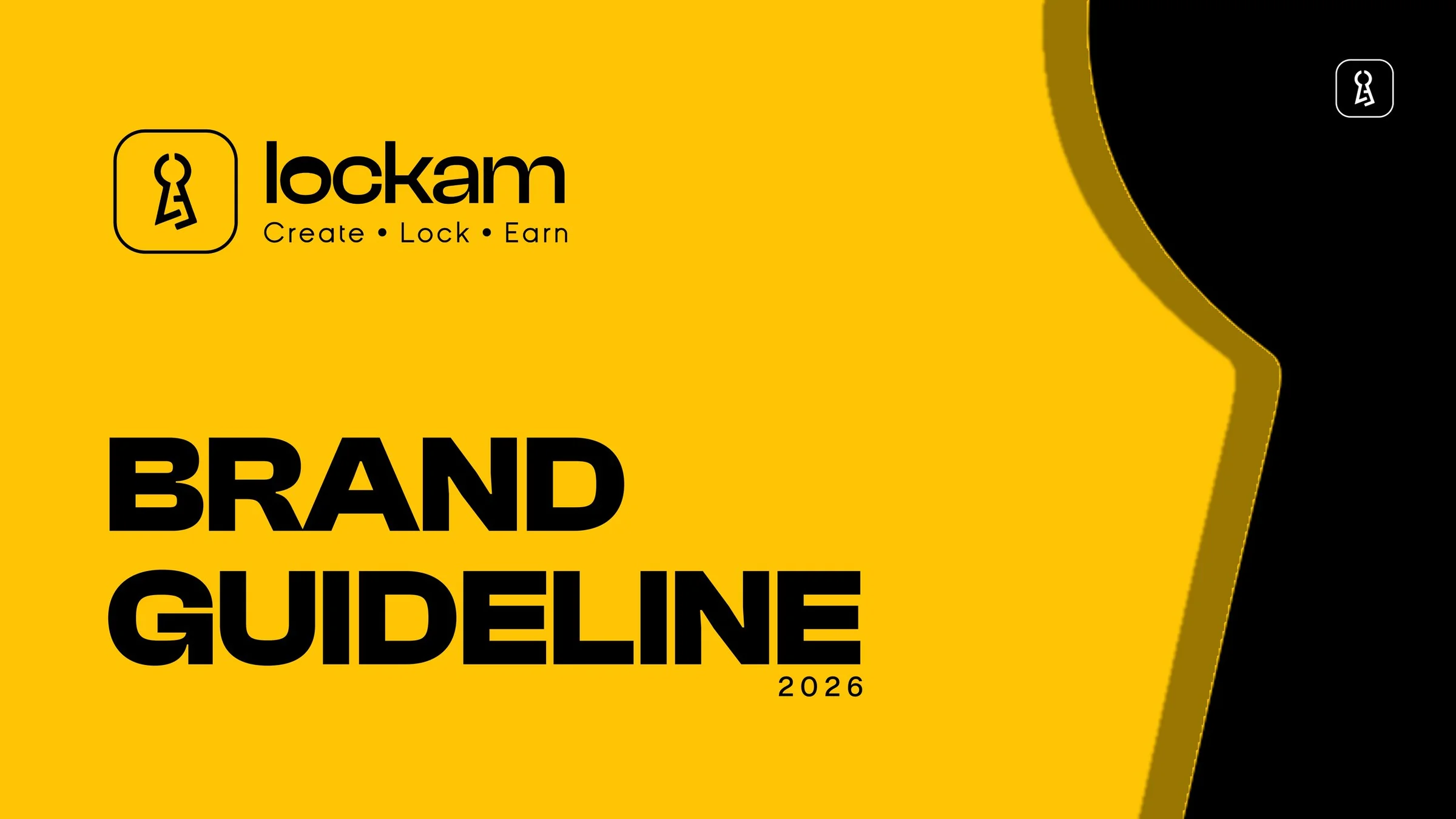
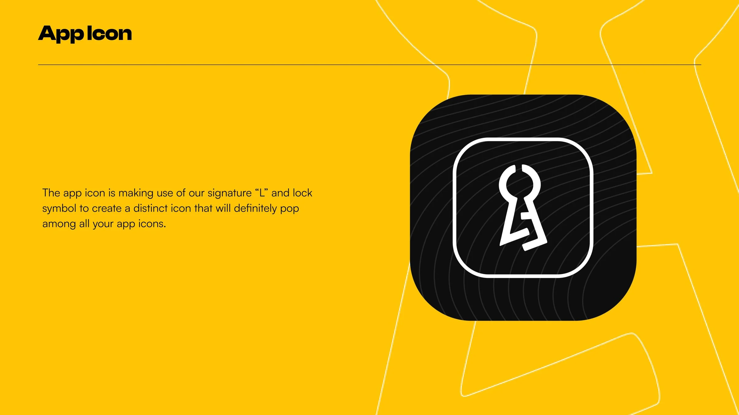
A key-and-lock idea turned into a recognisable brand signature.
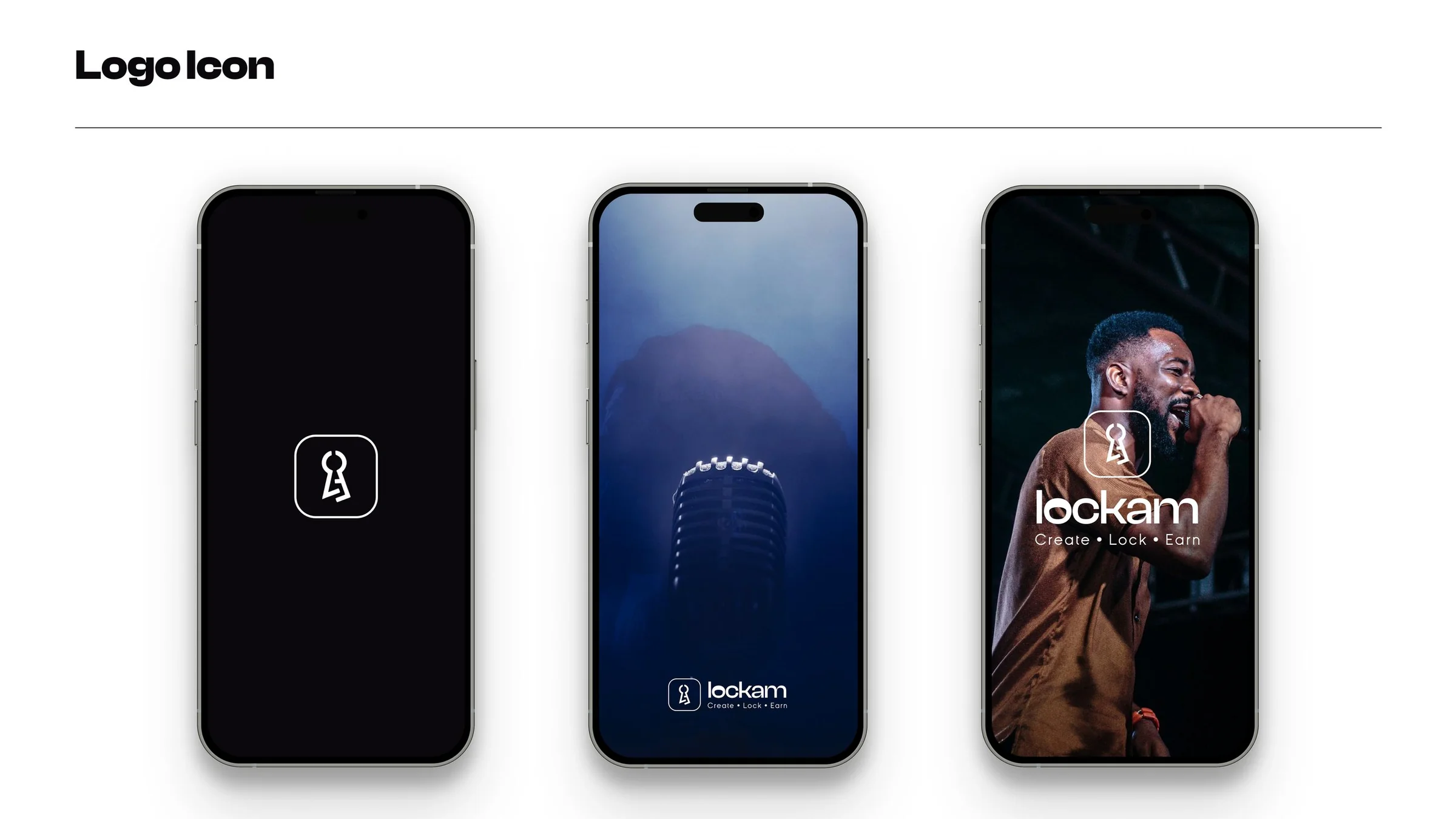
The identity centres on a key-inspired symbol and the line “Create · Lock · Earn”, connecting the idea of making money, setting it aside, and building value over time.
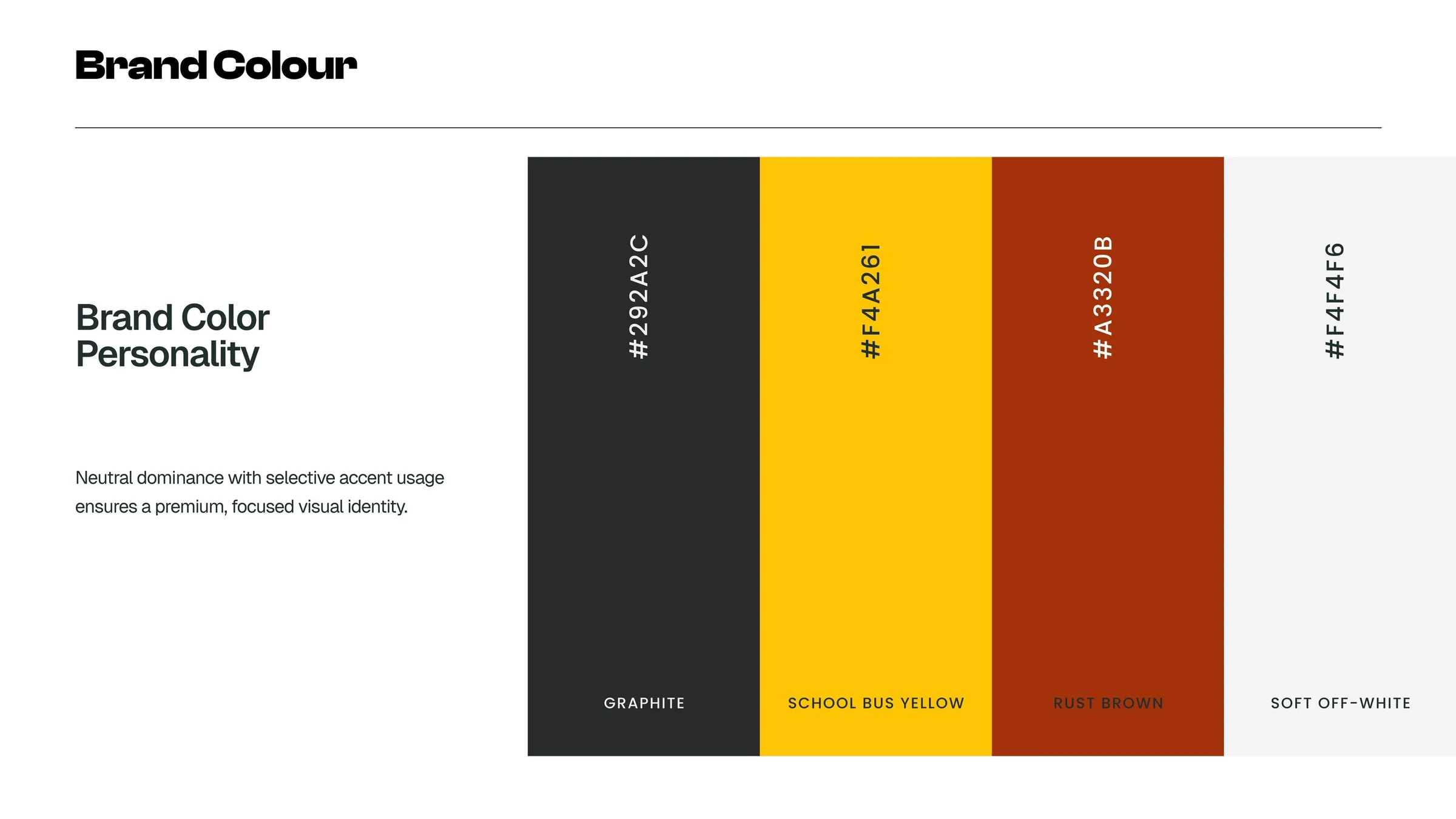
The visual language uses a bold yellow-and-black foundation with rounded geometry and a distinctive key mark, giving the system a clear presence across digital and physical applications.
Guidelines turn a strong mark into a repeatable system.
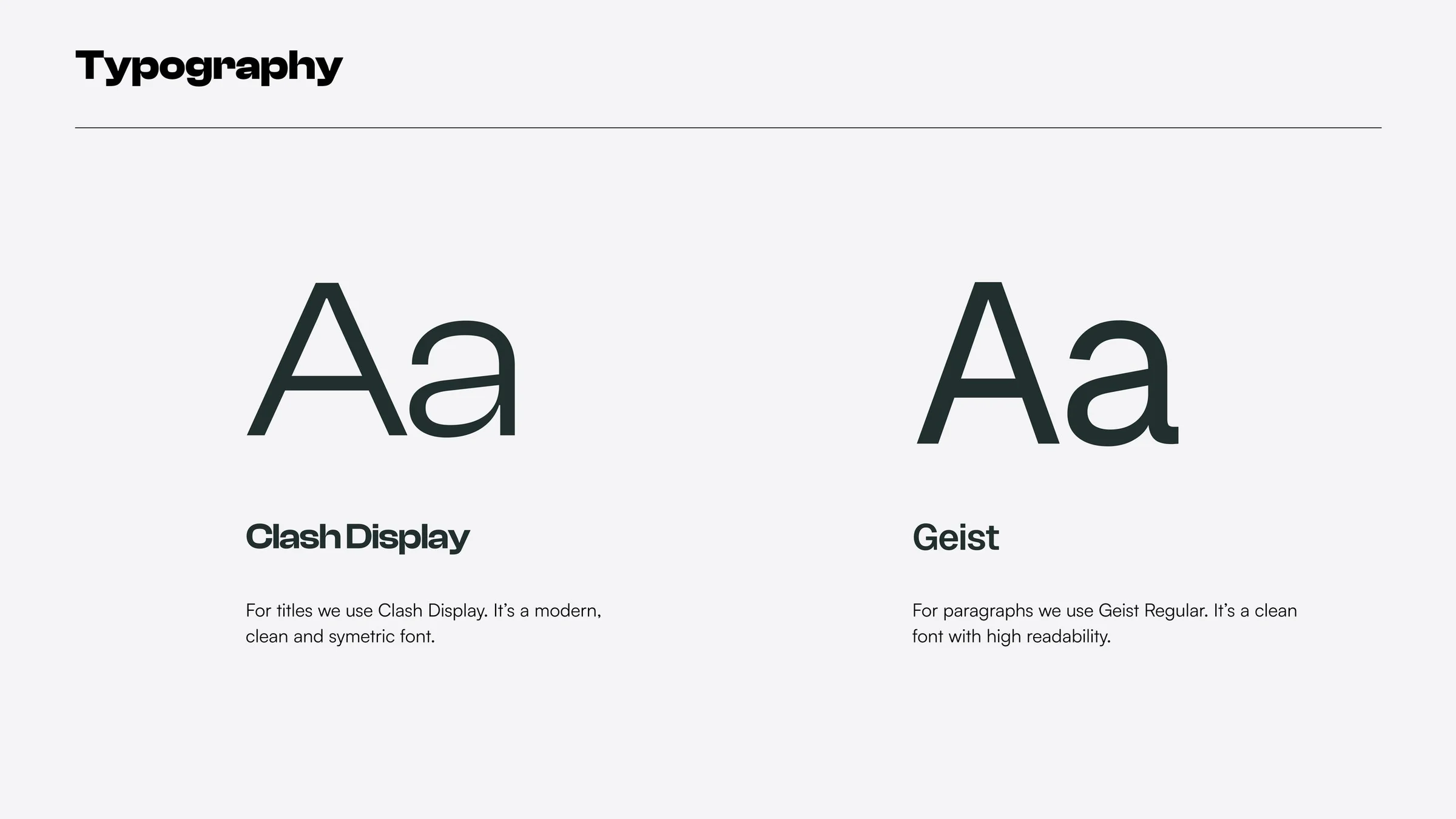
The supplied guideline covers core identity rules and shows how the brand can remain consistent as it moves between logo lockups, colour, typography, layouts, and application contexts.
The identity working across the brand book.
A curated view of the supplied guideline pages, arranged as a visual story so the identity can be reviewed from definition through application.

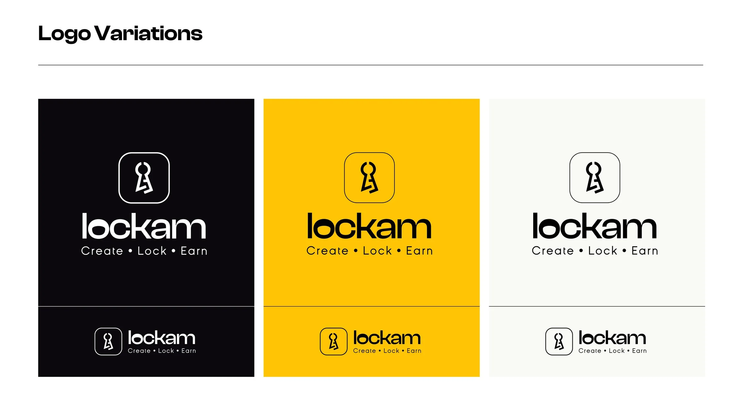
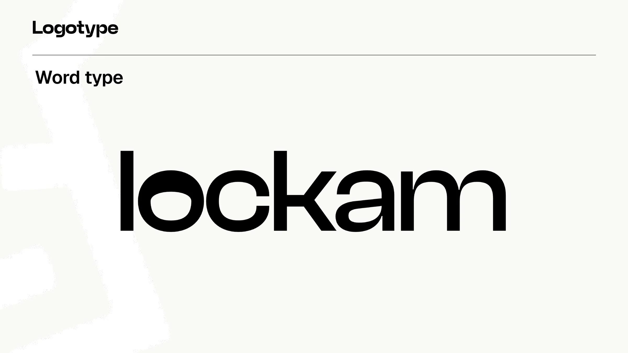
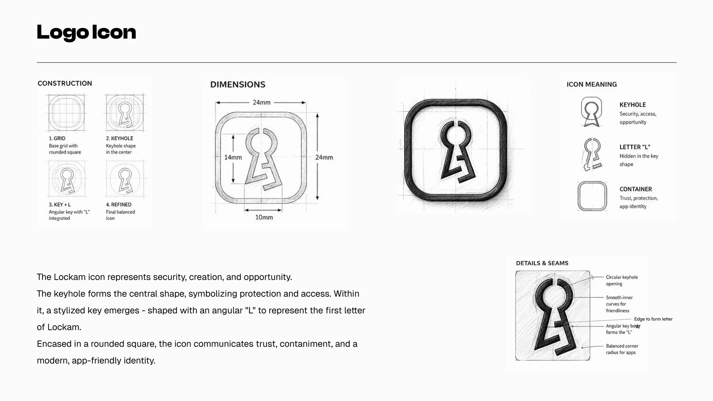


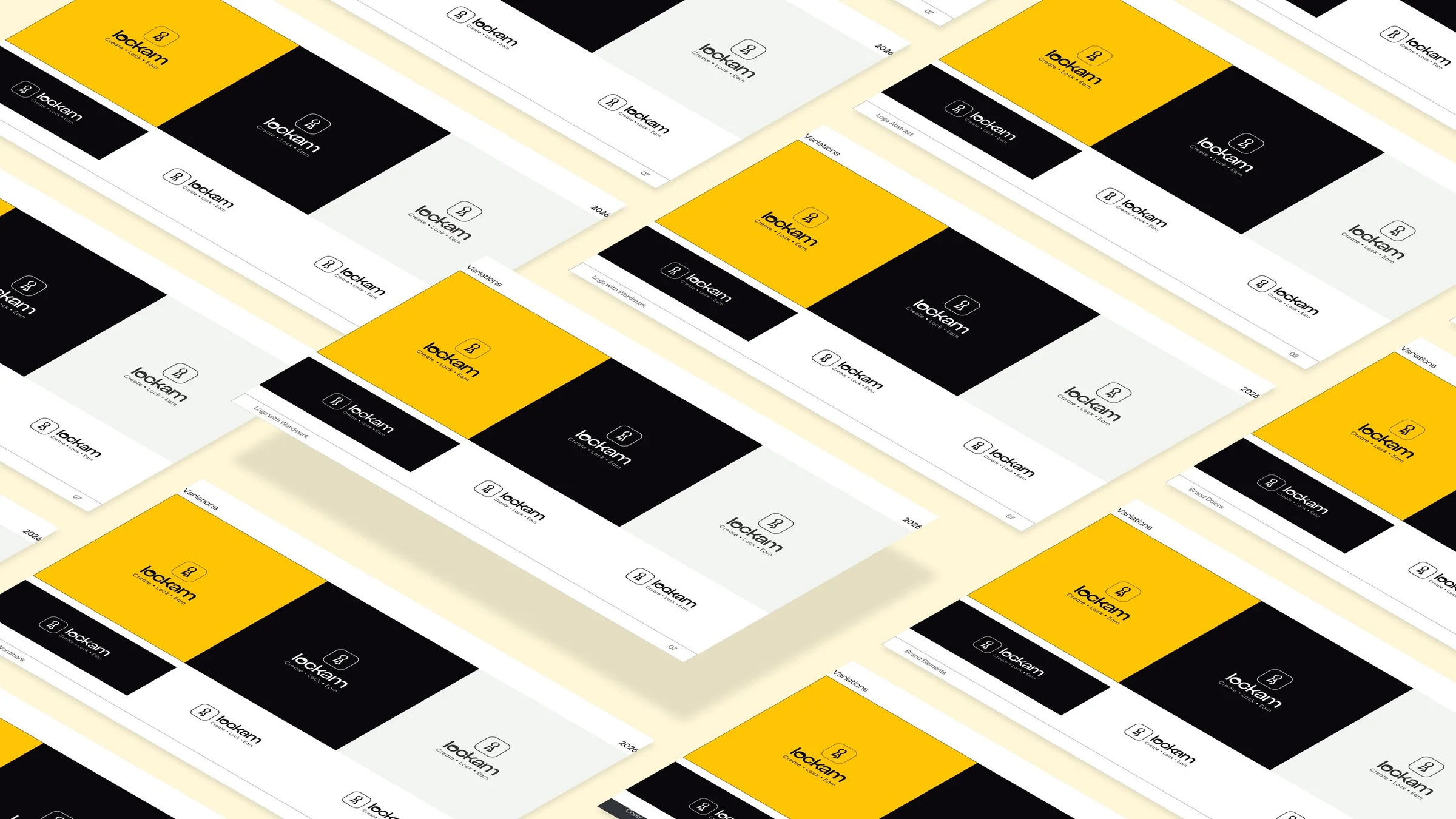
A distinctive identity with enough structure to scale.
The work is presented as a usable identity system rather than a standalone logo: a memorable symbol, a clear visual hierarchy, and a set of rules that can guide future digital, print, and marketing applications.