Papi Nailed It — a salon & spa identity carried through to a live website.
A visual identity and digital presence for a beauty and wellness brand, taking the salon's distinctive mark, colour language, typography and physical touchpoints into a customer-facing website with booking-focused calls to action.
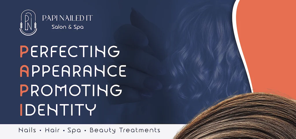
Build a beauty brand that feels polished, recognisable and ready for real-world use.
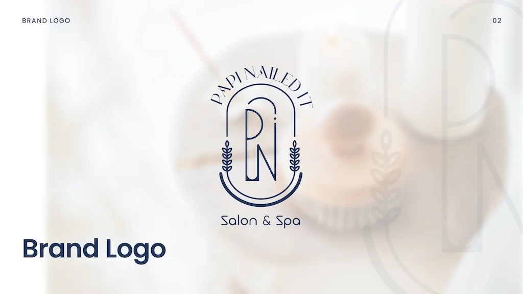
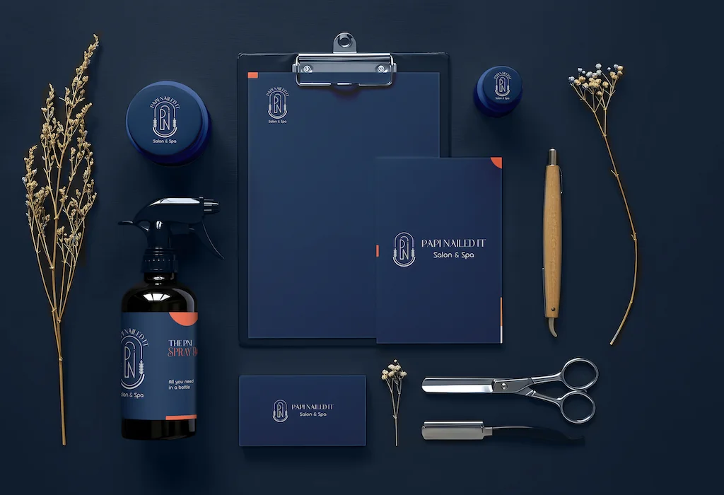
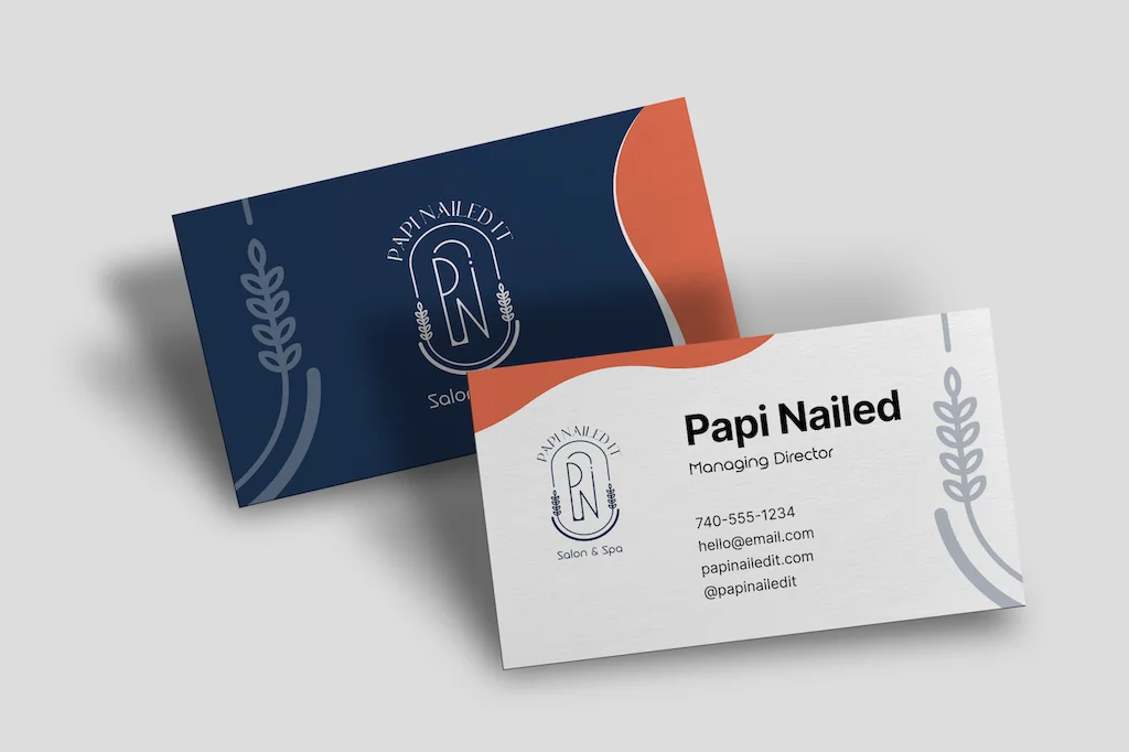
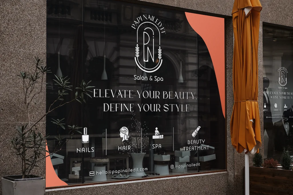
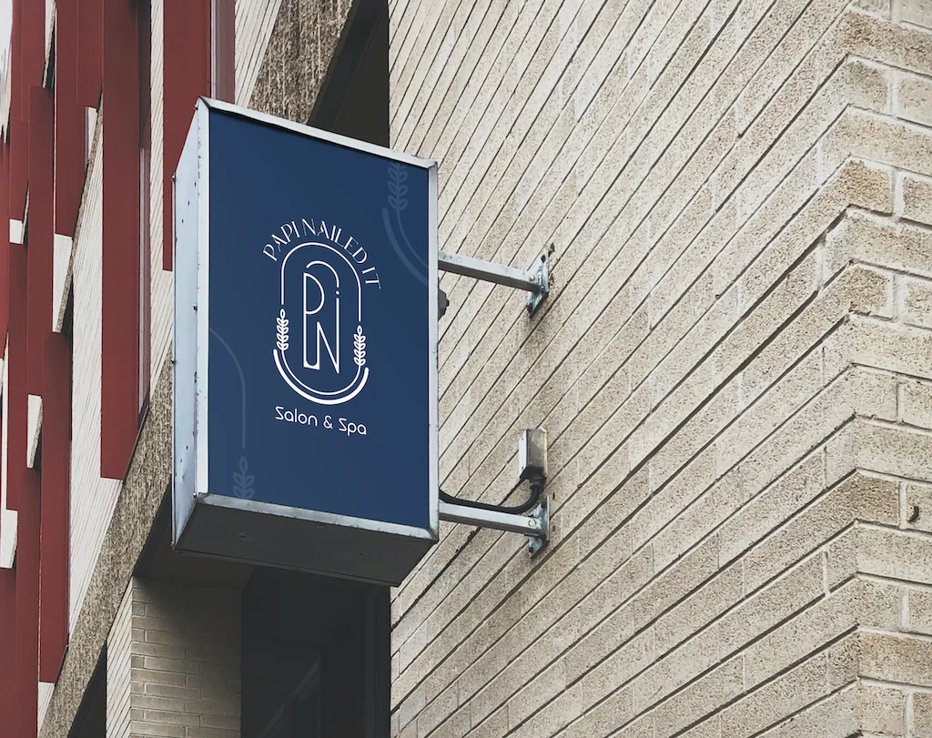
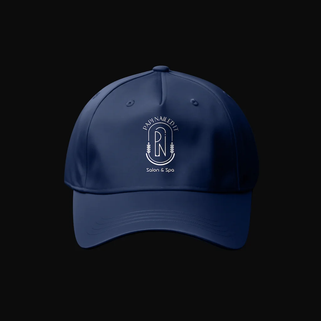
The supplied brand system centres on a circular PN monogram with a refined salon-and-spa wordmark. The identity was then extended into practical materials — cards, signage, uniforms, merchandise and promotional graphics — so the visual language could live consistently beyond the logo.
On the digital side, the website turns that identity into a service-led experience, introducing the salon, surfacing services, and repeatedly guiding visitors towards booking an appointment.
The logo is the anchor; the applications make the brand tangible.
A restrained navy-and-white identity with a warm accent creates a premium but approachable beauty-and-wellness feel.
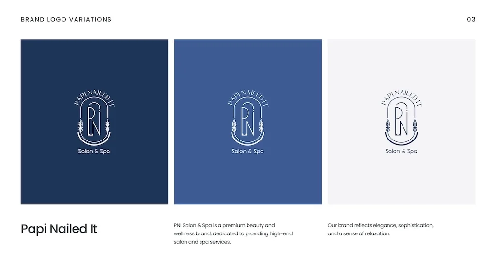
Designed as a system, not a single logo.
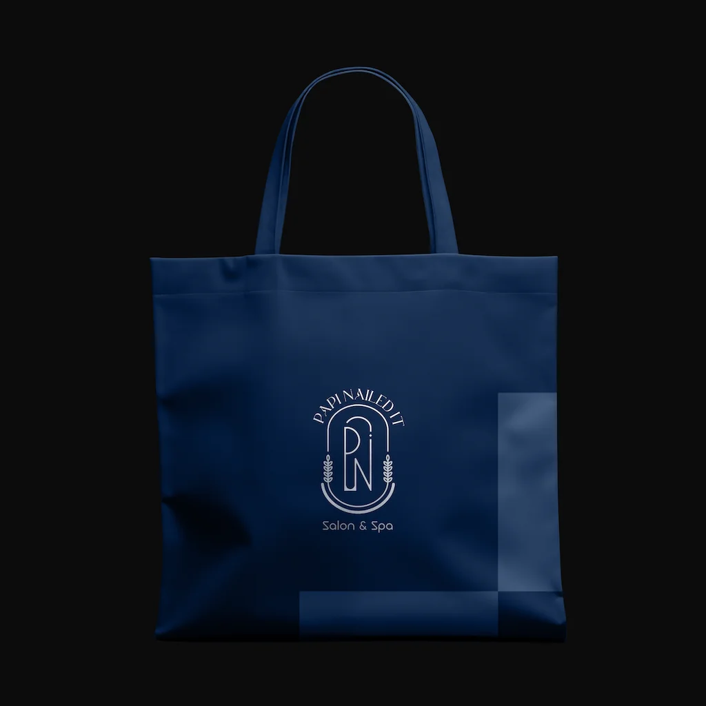
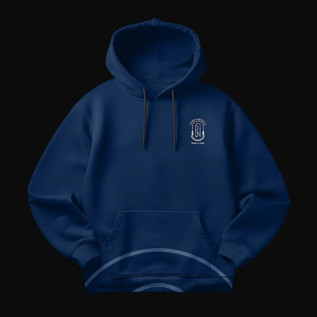
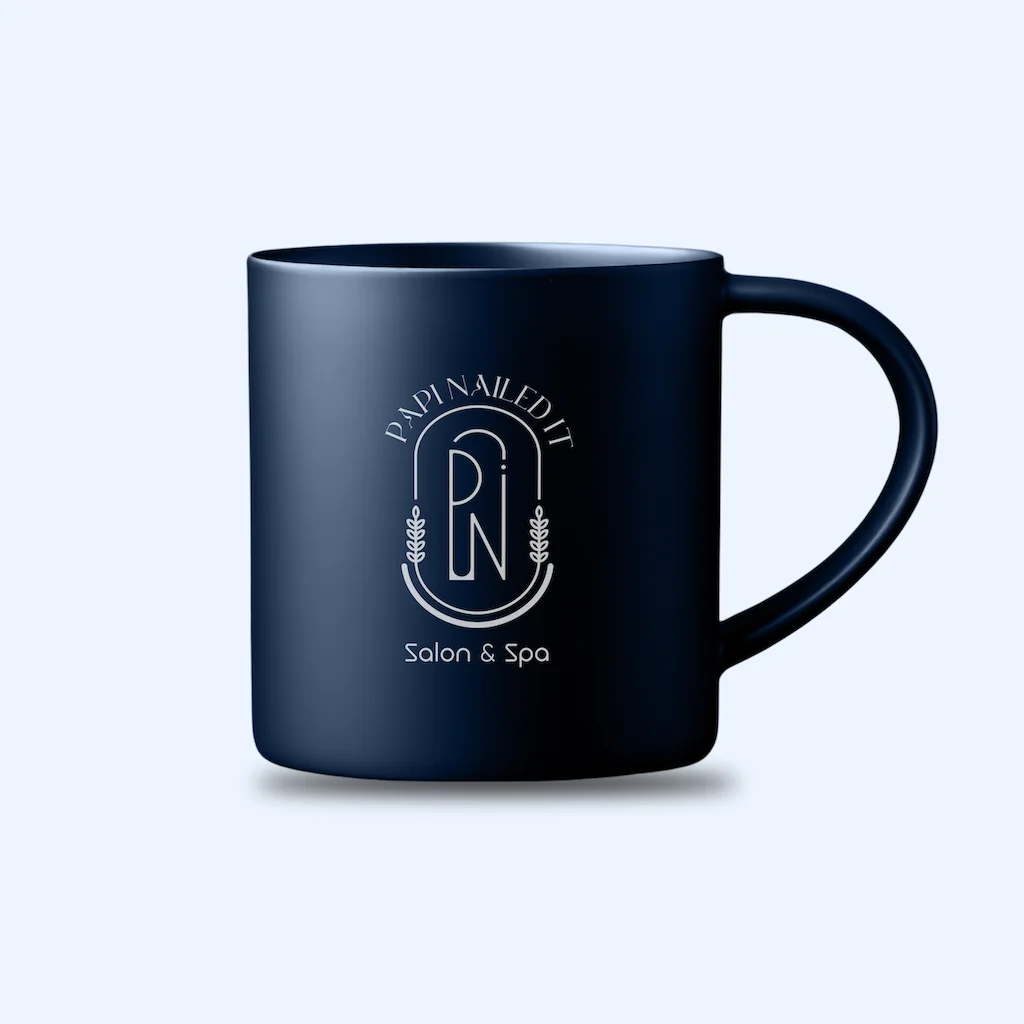
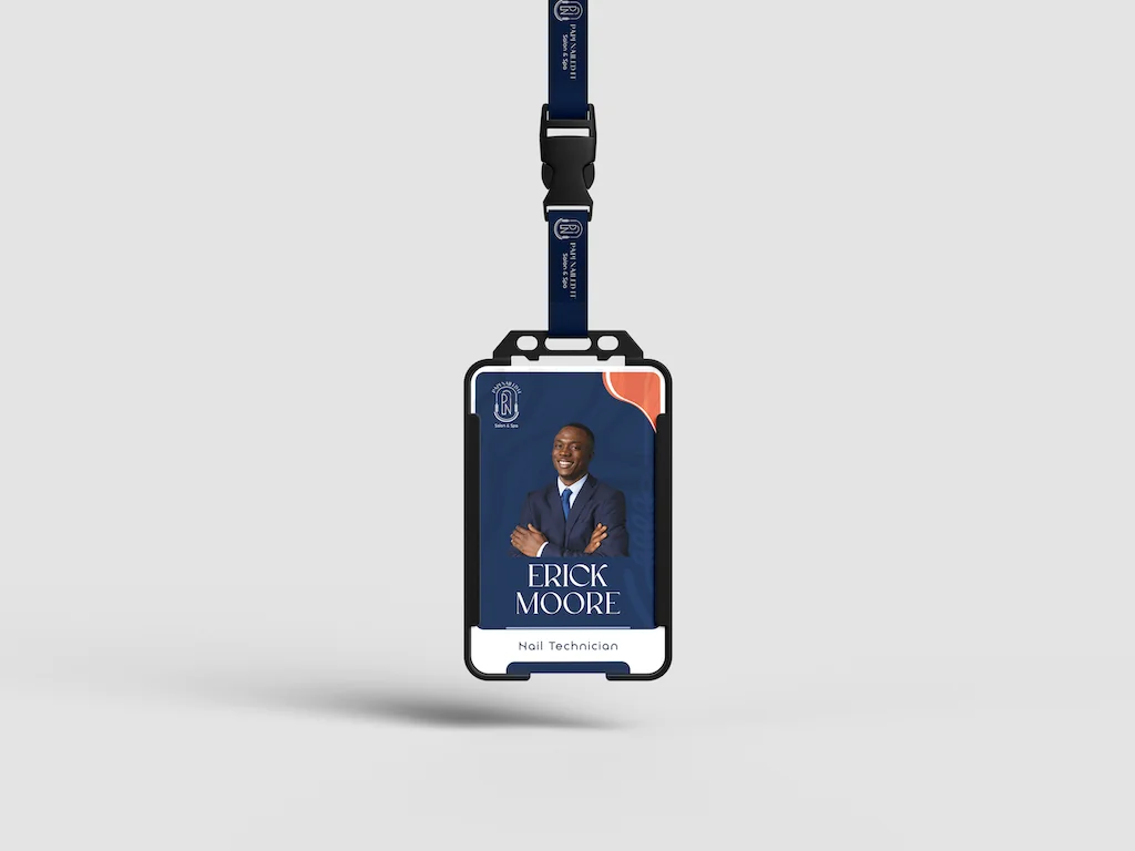
The supplied work shows the identity moving across service collateral, staff apparel, merchandise, signage, and environmental graphics.
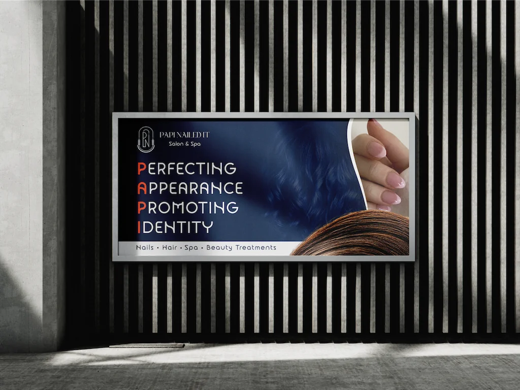
Turn the identity into a booking-oriented digital front door.
The live site extends the brand into a customer journey organised around the salon's core offer: salon, beauty and nail services. It uses service descriptions, repeated “Book Appointment” calls to action, team credibility, testimonials, location, opening hours and contact details to make the next step obvious.
The current site also exposes a customer account and booking flow, giving the experience a path beyond the marketing homepage.
One visual language travels from logo and collateral to physical spaces, staff apparel and merchandise.
The identity is represented in a live website rather than stopping at static brand assets.
Service discovery is paired with recurring booking prompts and clear contact information.
Identity should travel all the way to the customer experience.
Papi Nailed It is a useful example of the work crossing disciplines: identity defines the visual language, then web design and development turn that language into a live customer-facing experience.