Subsecute — subscribe without the surprises.
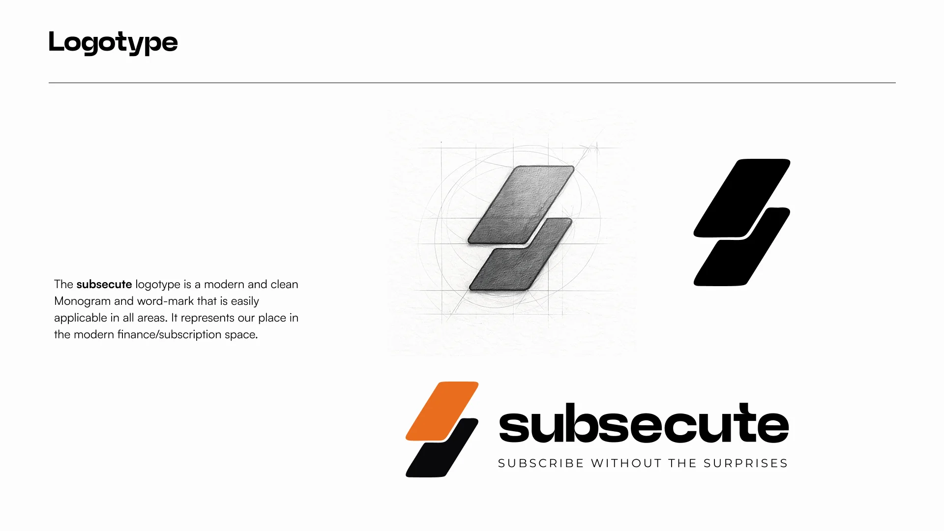
A visual identity for a subscription-management product, built around a distinctive S-inspired monogram, bold orange energy, a clean wordmark, and a system designed to work across product, app, social, and marketing touchpoints.

A modern subscription brand with a clear, energetic visual signature.
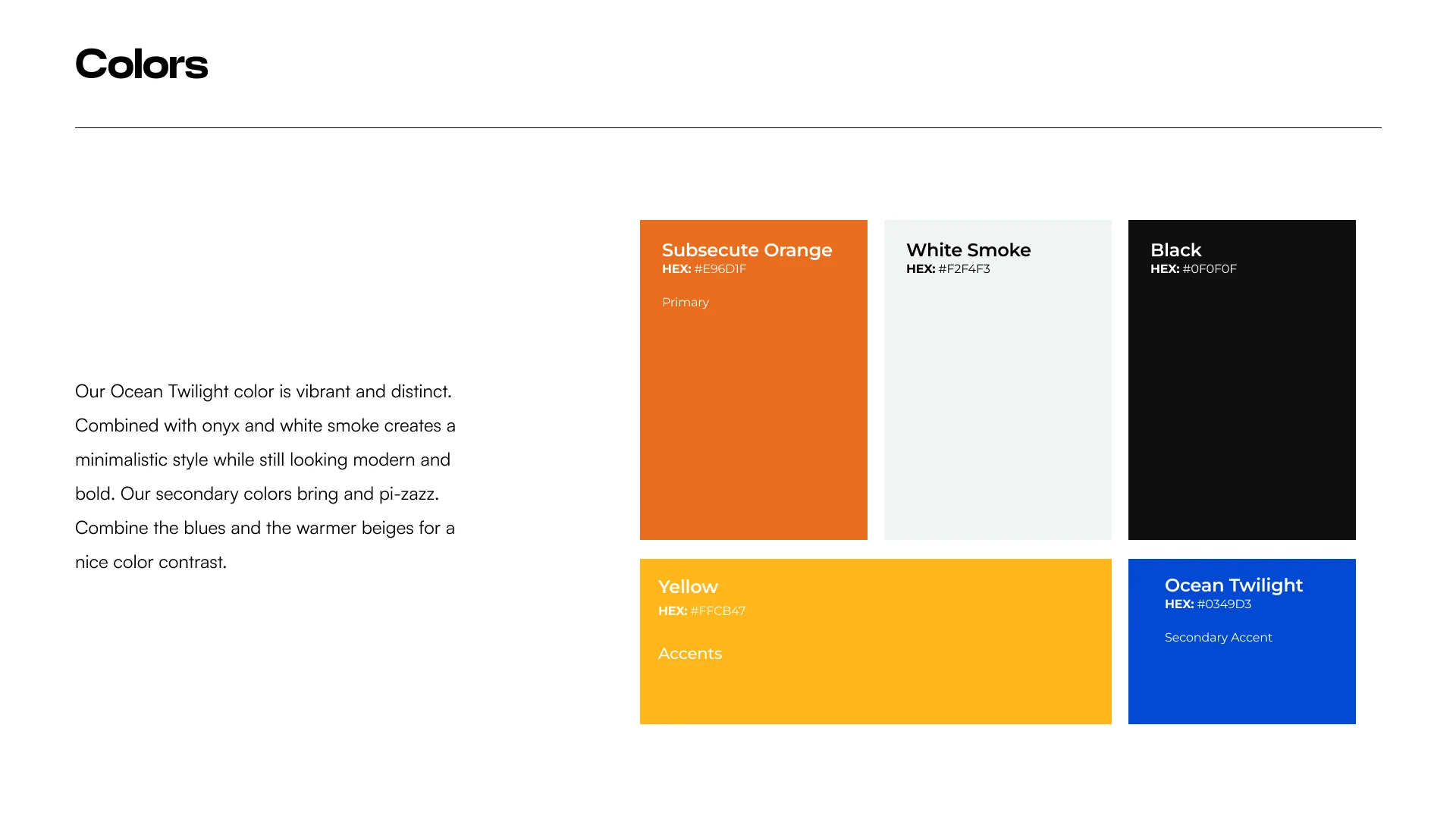
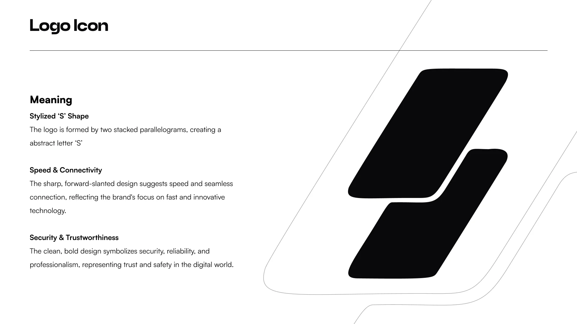
The supplied identity work positions Subsecute in the finance / subscription space with a system that balances modern product cues and consumer energy. The monogram and wordmark establish recognition, while the bright orange, black, smoke-white, yellow and blue palette creates a flexible visual toolkit.
The mark gives the identity a compact, repeatable signature.
The identity set explores the monogram, wordmark, colour combinations and supporting logo configurations so the brand can move from full lockups to app-scale uses without losing its character.
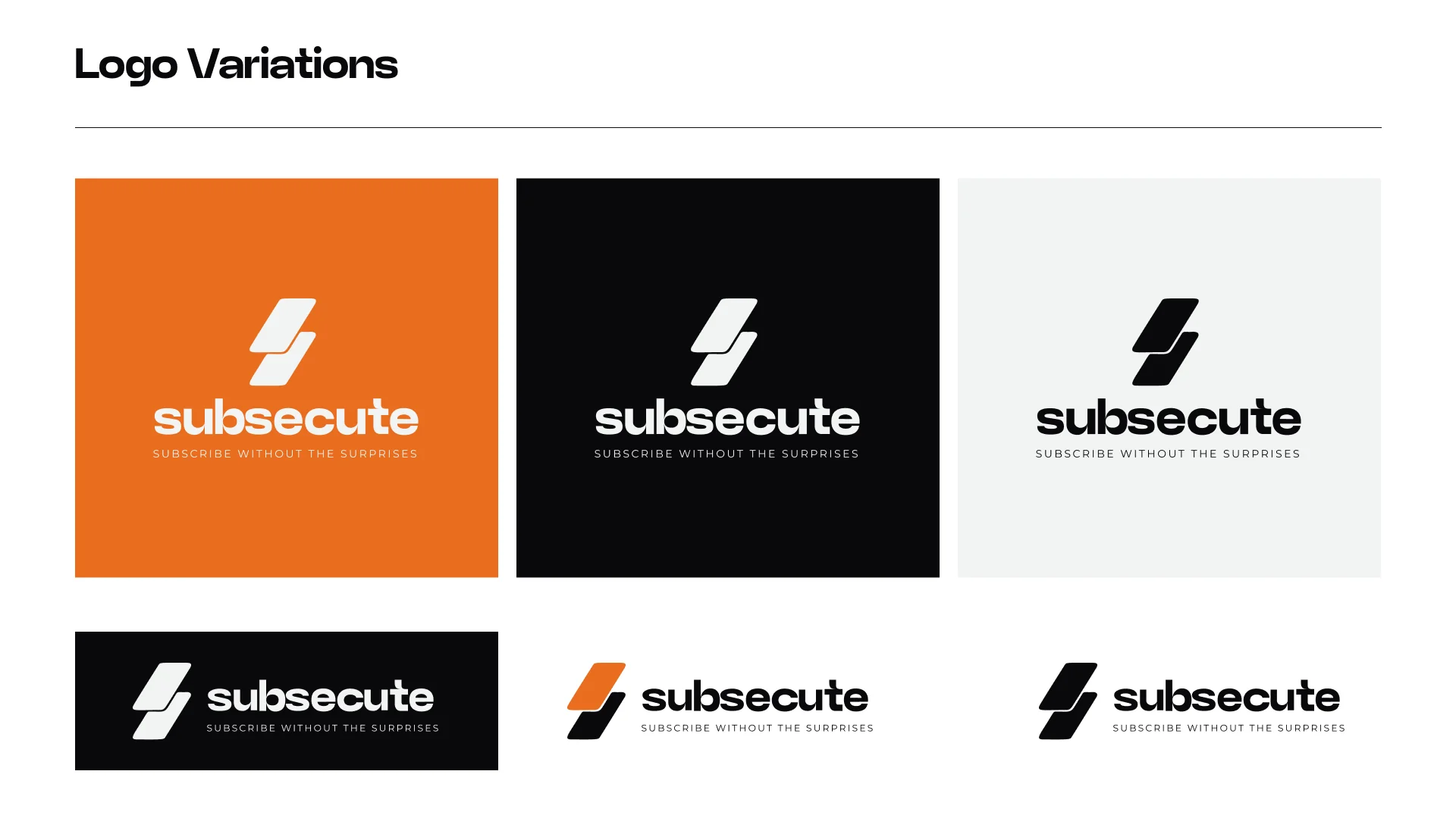
The system is designed to feel consistent wherever the product shows up.
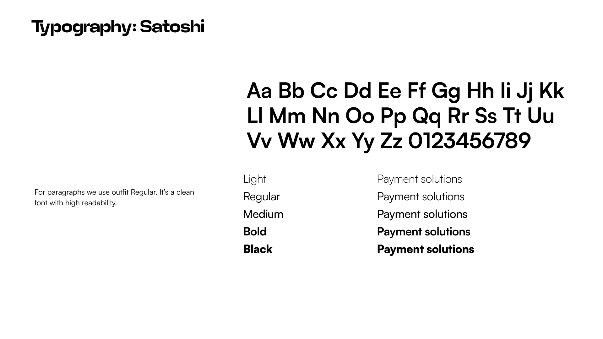
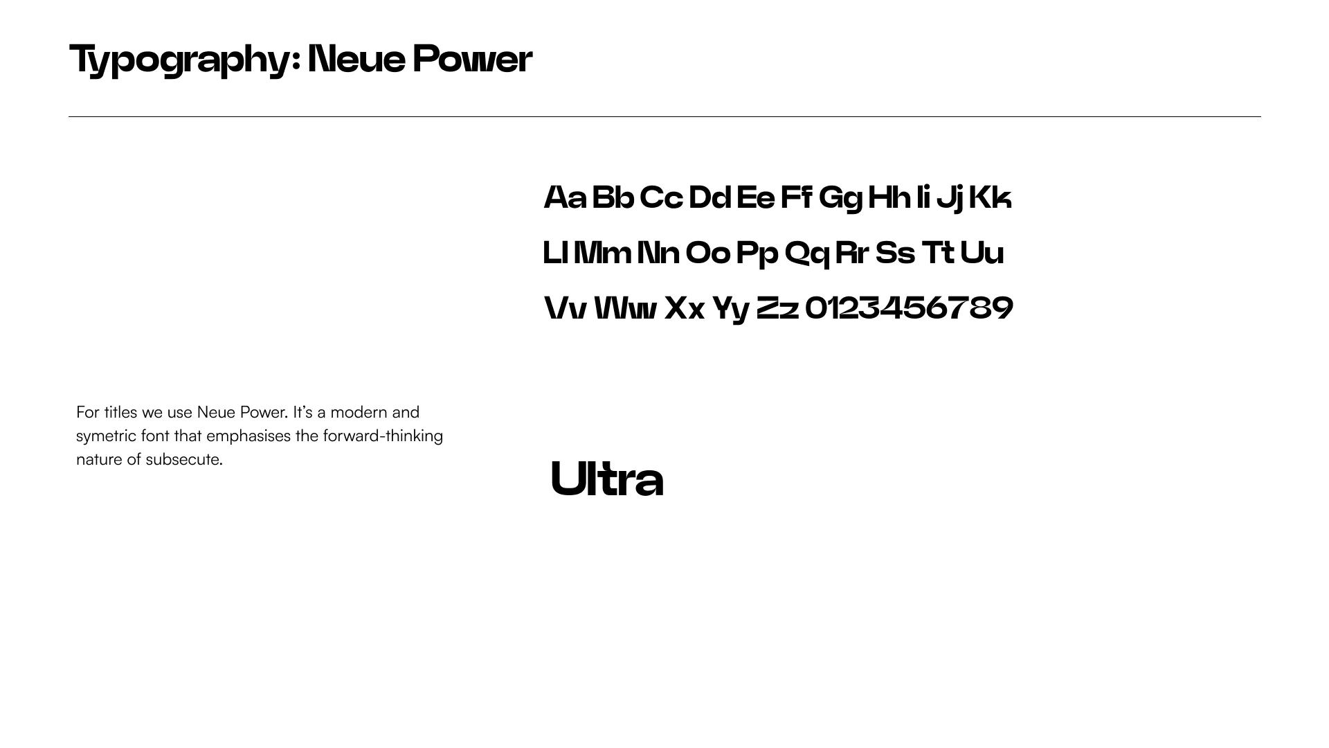
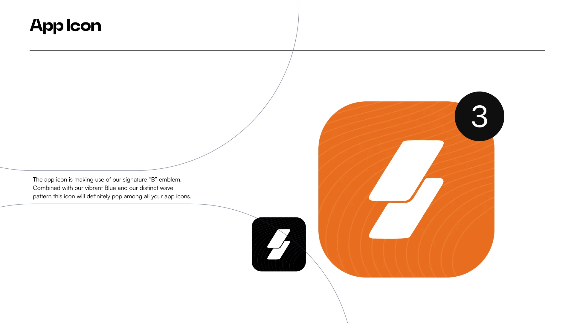
The supplied guidelines connect typography, colour, logo iconography and app presentation into one visual system. This creates a clear bridge between brand identity and the subscription-management experience itself.
From identity system to product and campaign touchpoints.
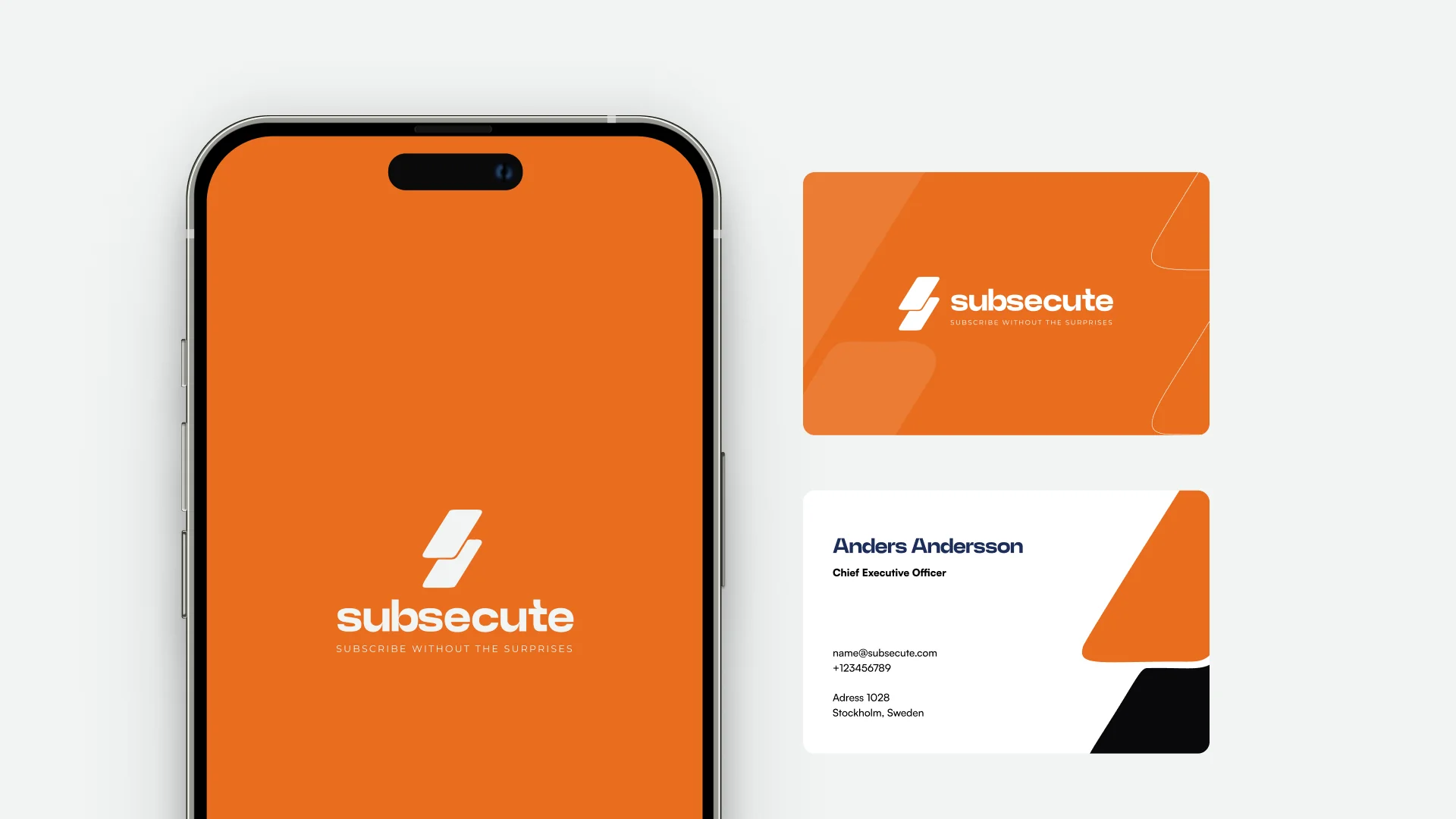
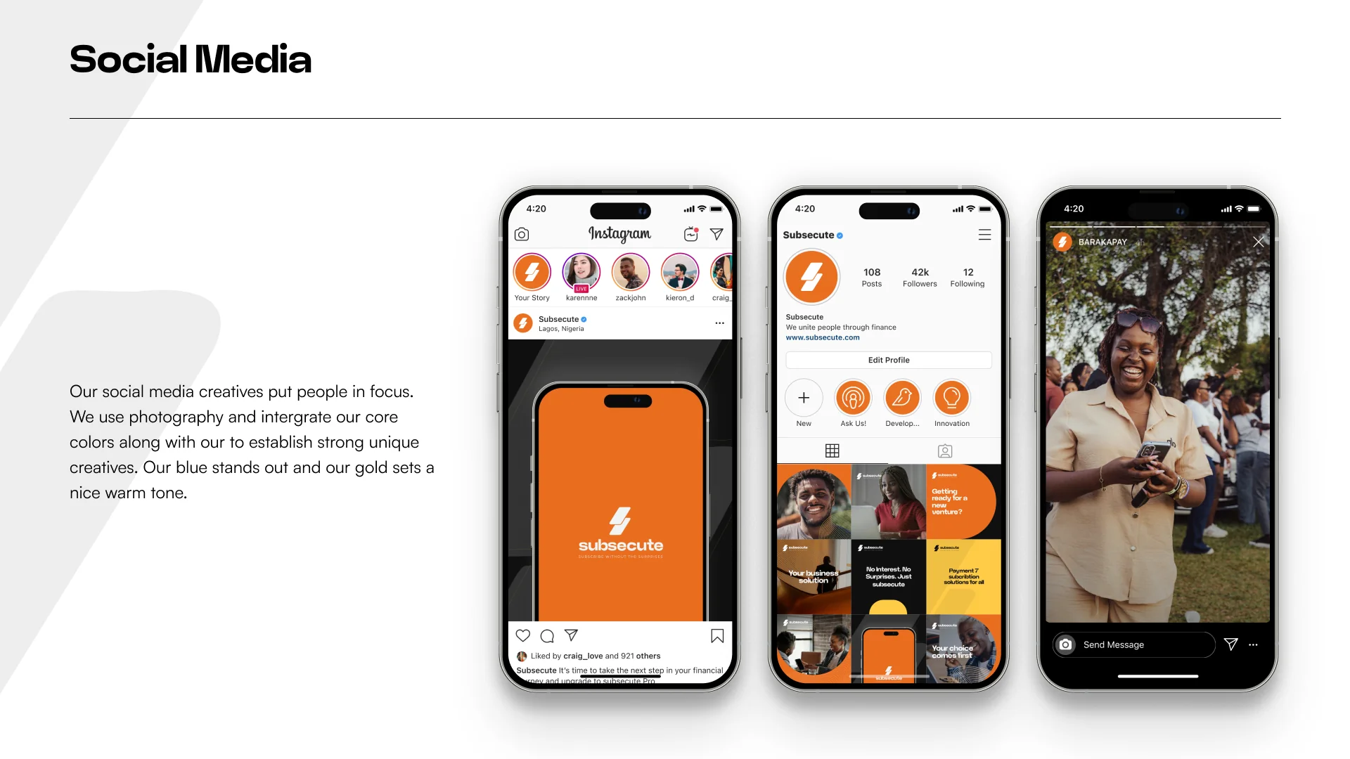

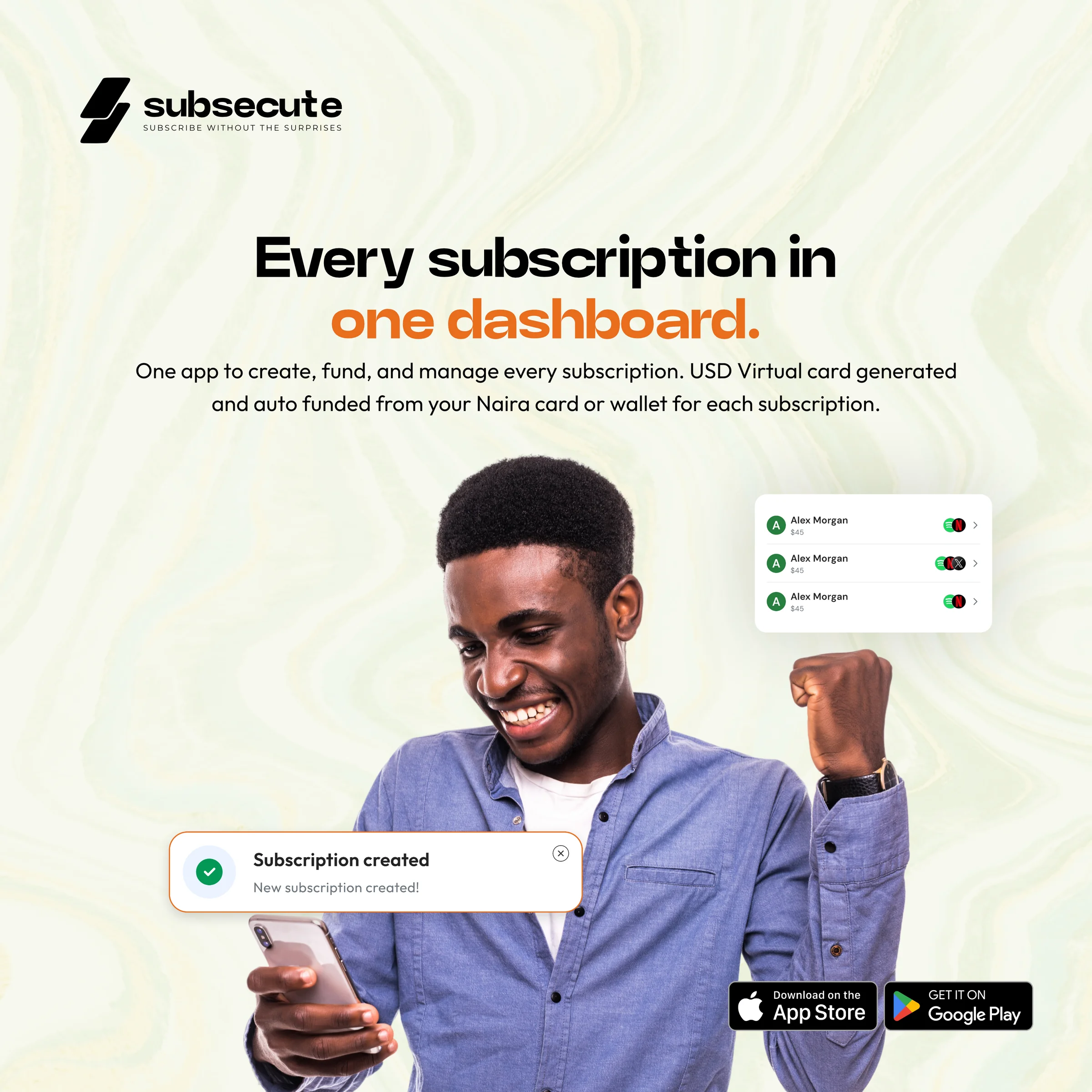

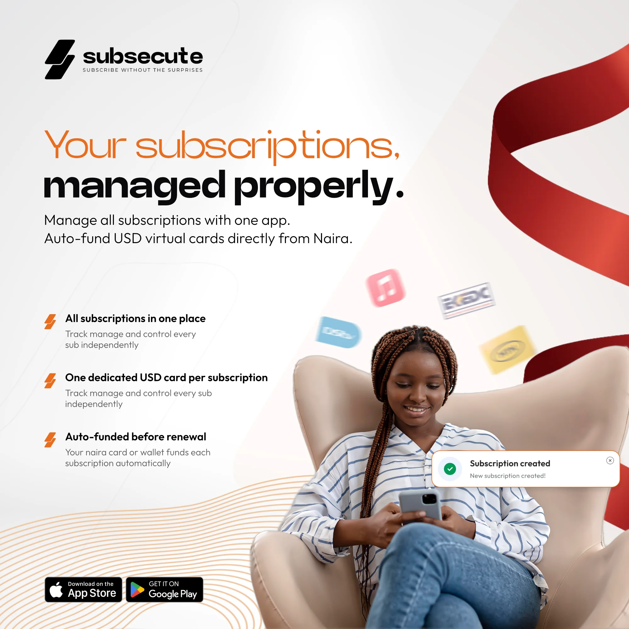

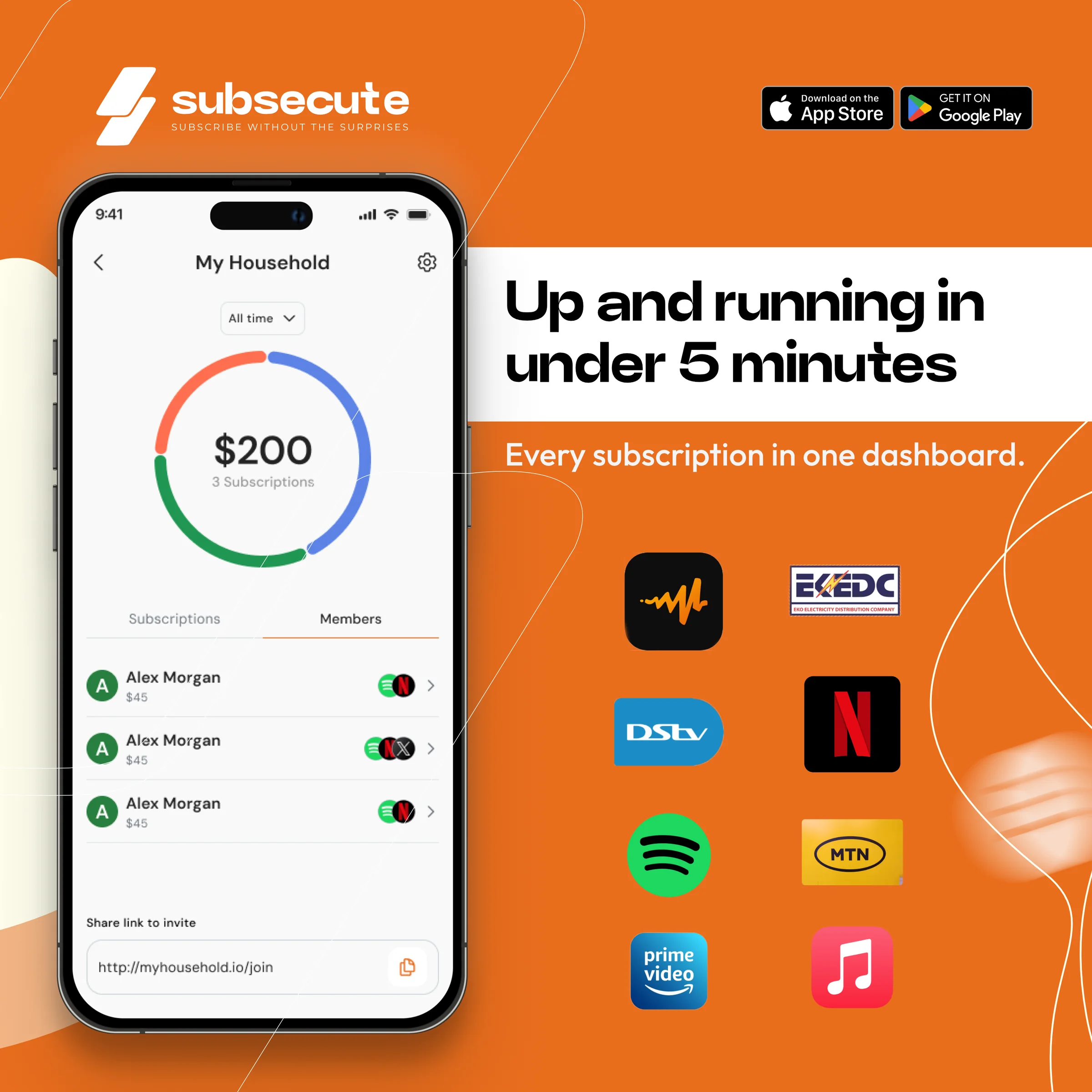
A flexible identity system for a subscription-first product.
The supplied work shows the identity operating as a system — not only a logo — across product, app iconography, social content and marketing communication.