Making internet banking easier to navigate and easier to use.
A redesign of Keystone Bank’s retail internet banking experience, focused on improving process efficiency, simplifying onboarding, and making everyday banking tasks more intuitive.
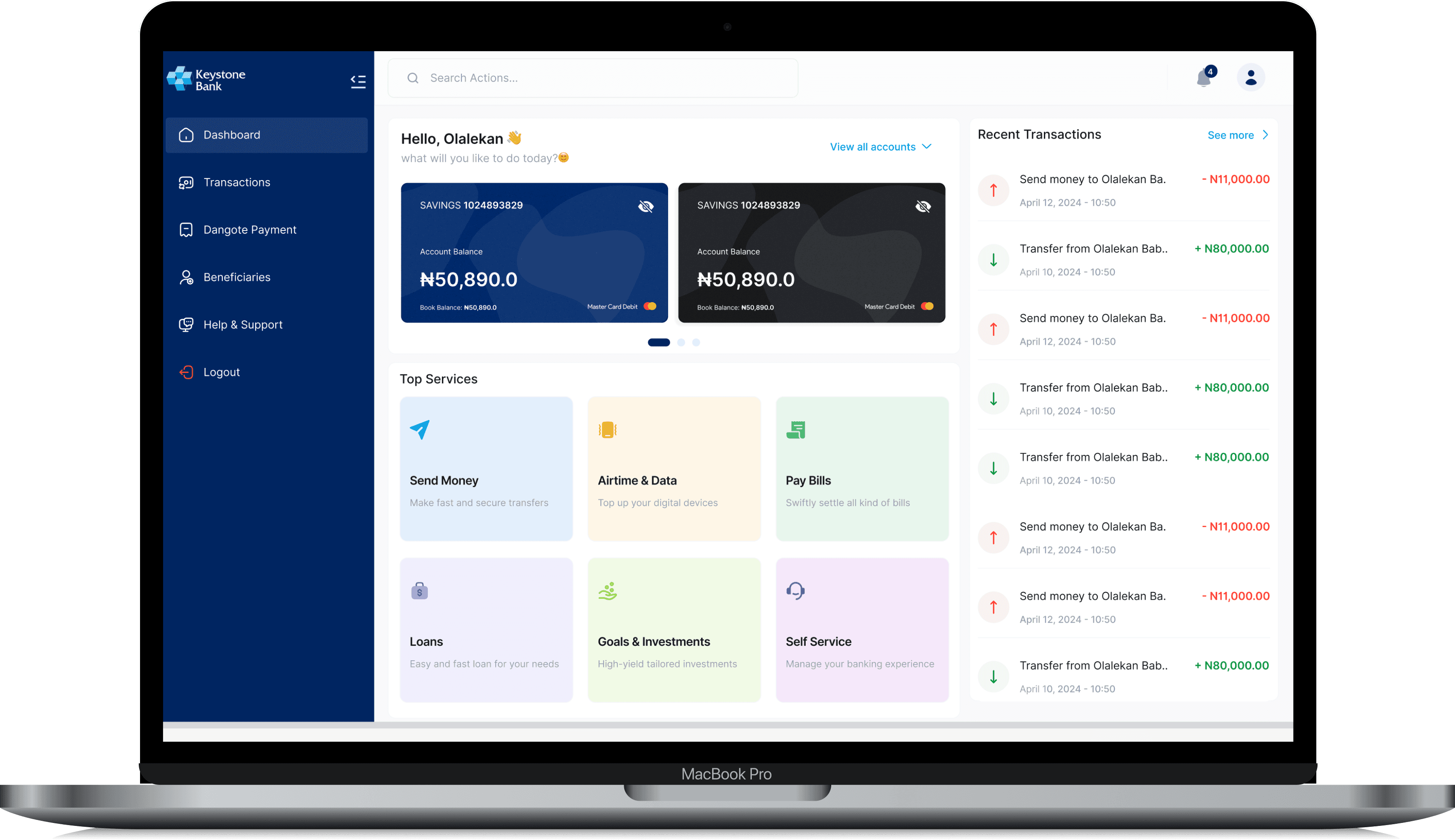
Turn a broad banking surface into a clearer task-oriented experience.
The project started with an existing internet banking experience that needed stronger usability, a clearer interface and better navigation.
The redesign had to account for a broad customer base and a large product surface while keeping key banking tasks — logging in, checking balances, moving money and reviewing transactions — straightforward.
Research, structure, flows and high-fidelity UI.
The original case study describes a research-led process: reviewing user feedback from app stores, identifying recurring problems, analysing competitors and creating user personas before iterating on the interface.
Make the bank feel like one connected workspace.
Bring common tasks such as send money, bills, airtime, loans and self-service into the primary dashboard.
Balance, card and transaction information stay close to the action that depends on them.
Keep the first decision simple, then reveal the more detailed fields and transaction context only when needed.
Use consistent cards, navigation, tables and labels to make information easy to find quickly.
From dashboard to transaction completion.
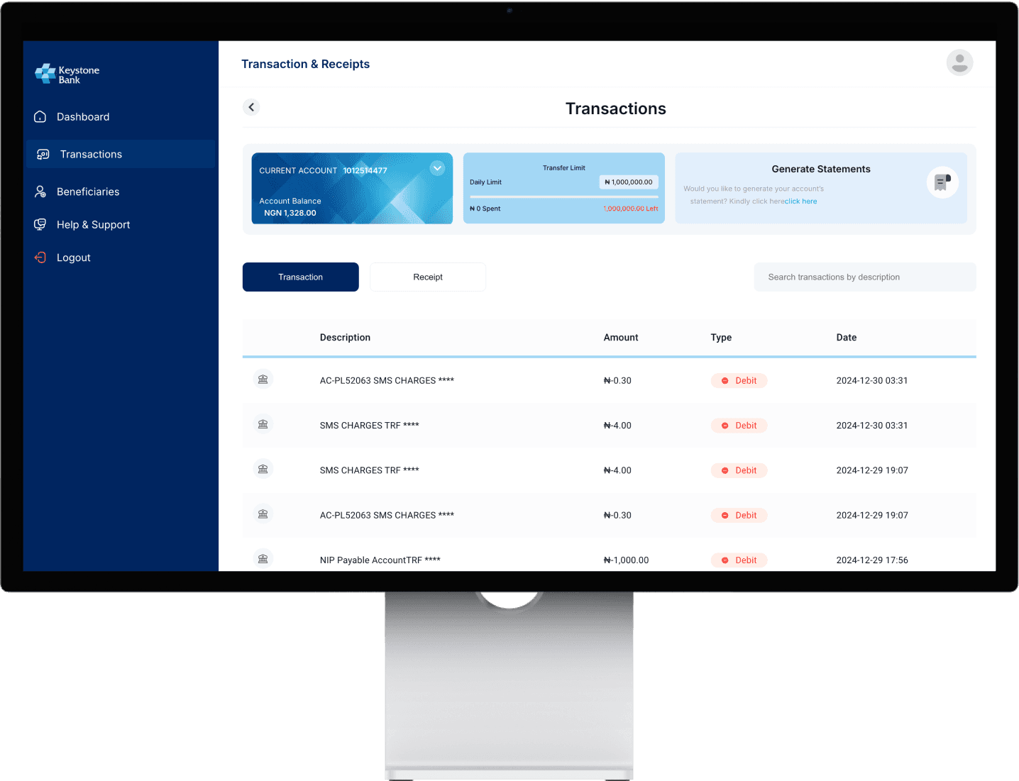
Project visuals and narrative adapted from the original portfolio case study. Open the original project ↗
A clearer banking workspace built around everyday intent.
The final direction brings the most important banking tasks into a consistent structure, with clearer navigation and stronger visual hierarchy across dashboard, transactions and transfer flows.
The work shows an end-to-end UX approach: investigate problems, turn findings into principles, simplify the task flow and then express that structure through a coherent UI system.