Making everyday banking feel simpler.
My contribution to the KeyMobile redesign at Keystone Bank — translating a broad set of banking requirements into clearer flows, reusable interface patterns, and high-fidelity screens across everyday banking.
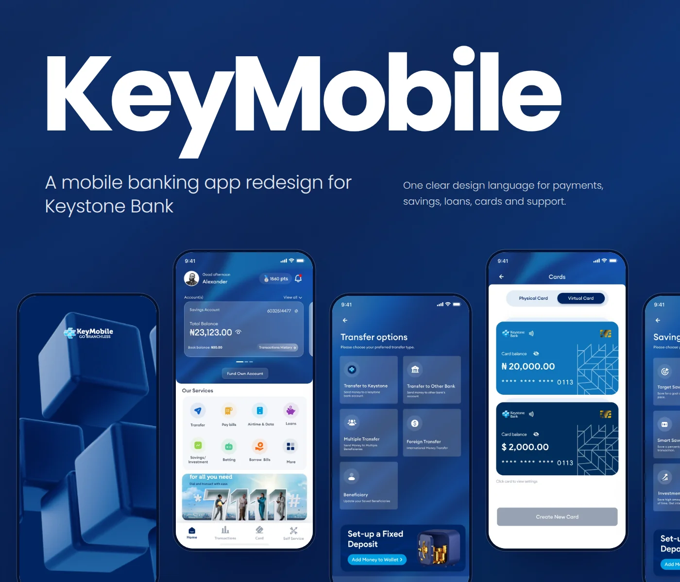
The problem was bigger than a single screen.
KeyMobile had to support a growing number of banking jobs inside one mobile product: moving money, paying bills, managing cards, saving, borrowing, and handling account issues.
The design challenge was therefore not simply to make individual screens look better. It was to make a large set of journeys feel like one product — with enough clarity for everyday customers and enough structure to support complex financial tasks.
My work sat inside that wider product effort: taking requirements and journey needs, shaping flows, and turning them into high-fidelity interfaces that could be reviewed with product and engineering stakeholders.
From requirements to usable product flows.
I worked across the product rather than owning one isolated feature.
Reduce cognitive load without hiding the complexity.
The key decision was to treat the experience as a system of related journeys, not a collection of disconnected screens. That shaped how information was grouped, how actions were sequenced, and how repeated patterns were handled.
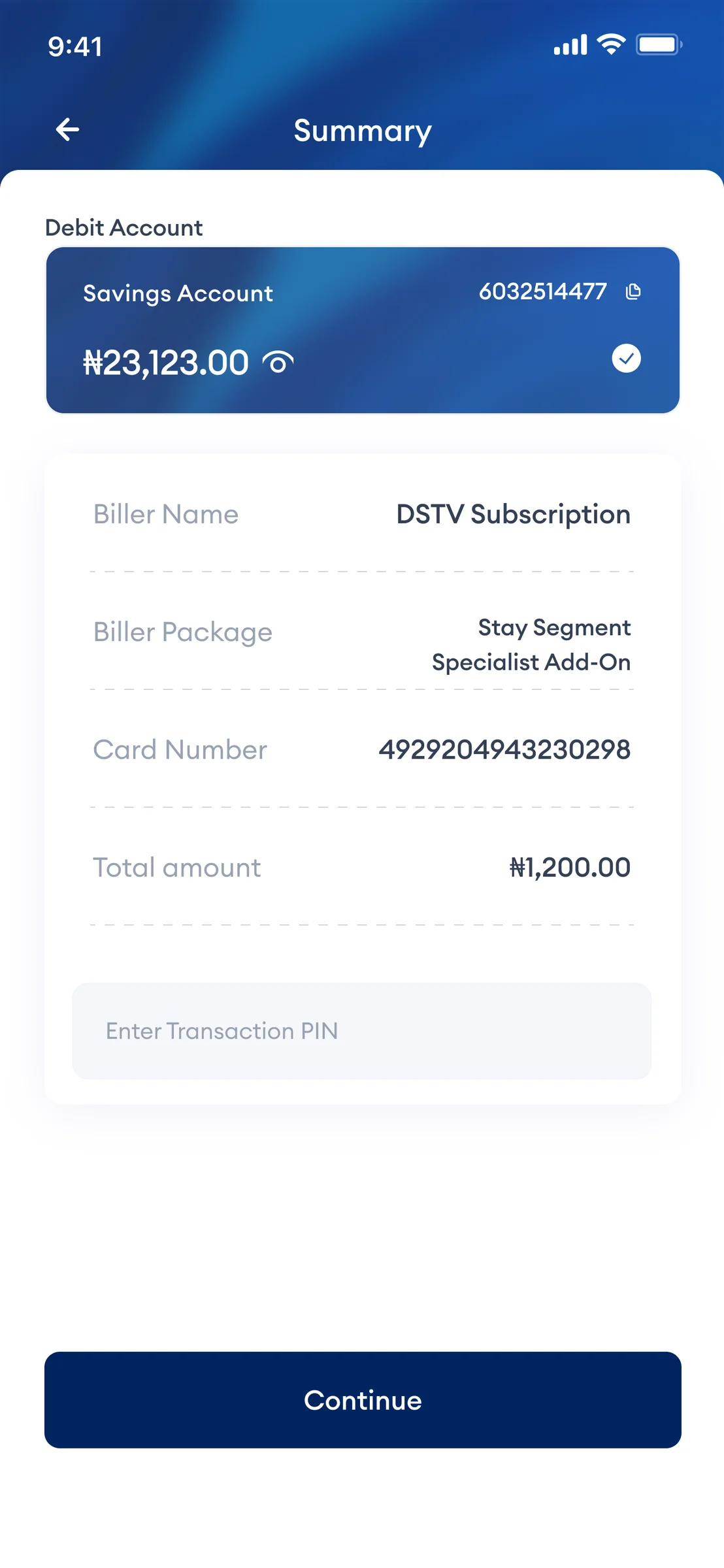
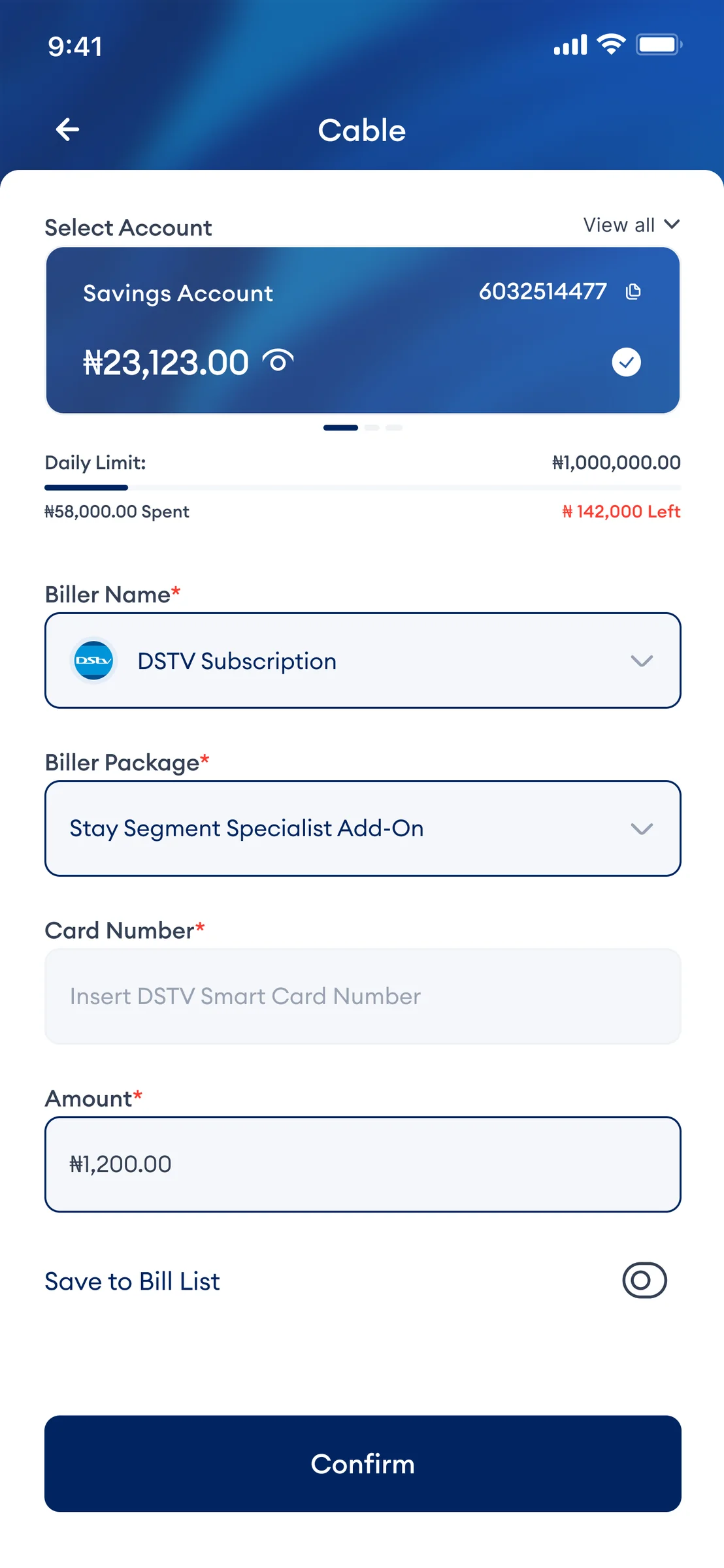
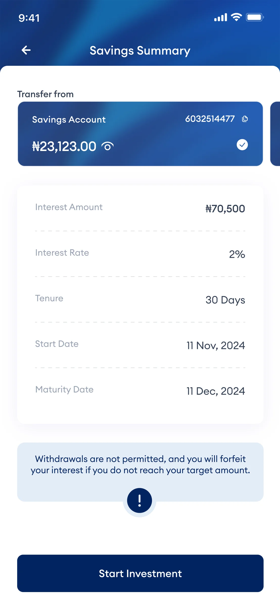
Task-heavy screens use hierarchy and grouping so users can understand what is required before committing to the next step.
Transfers, beneficiaries, summaries and confirmations follow recognisable structures so users spend less effort learning the interface.
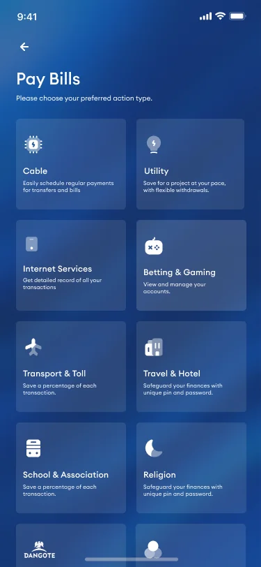
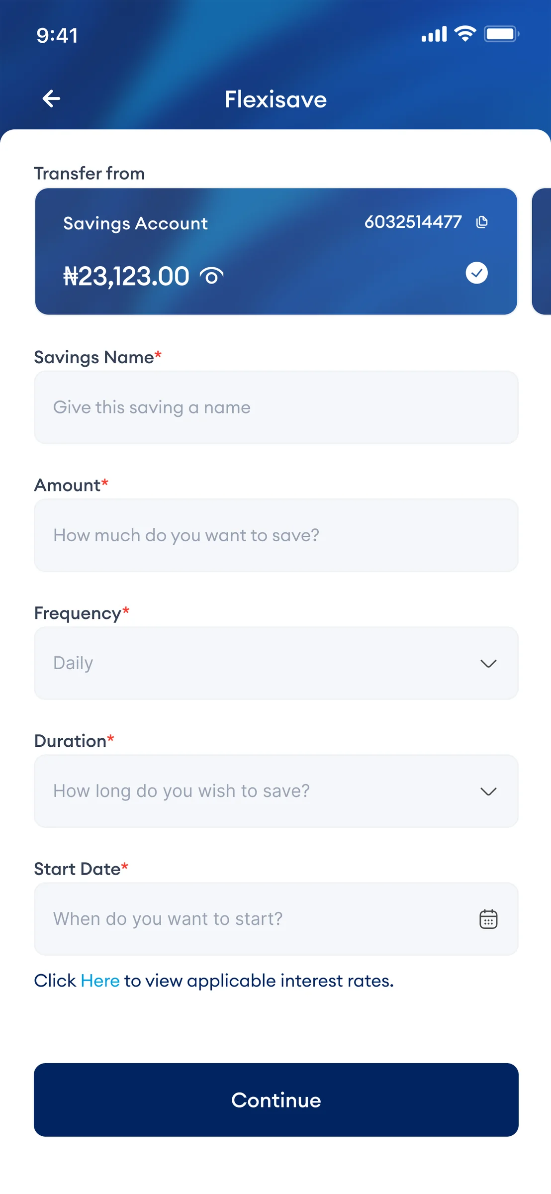
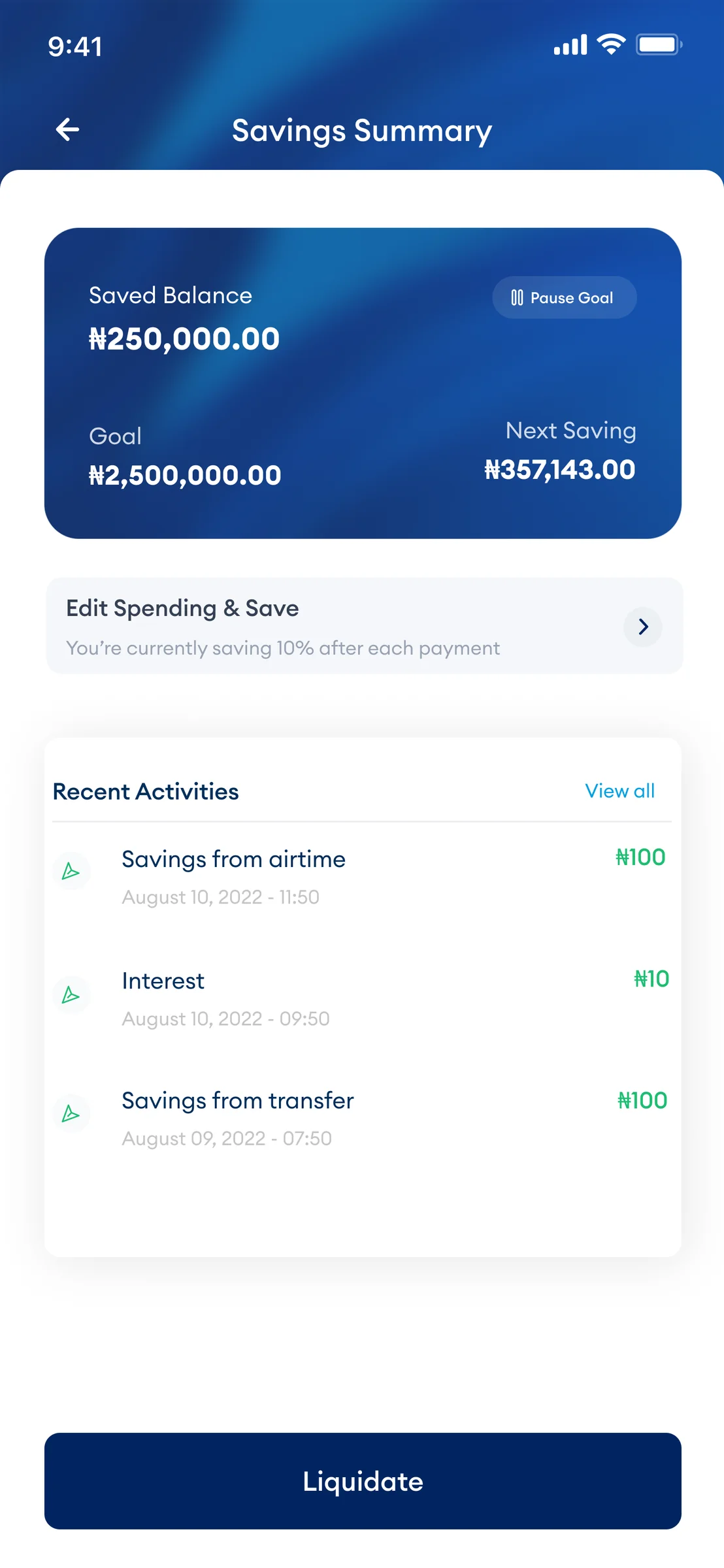
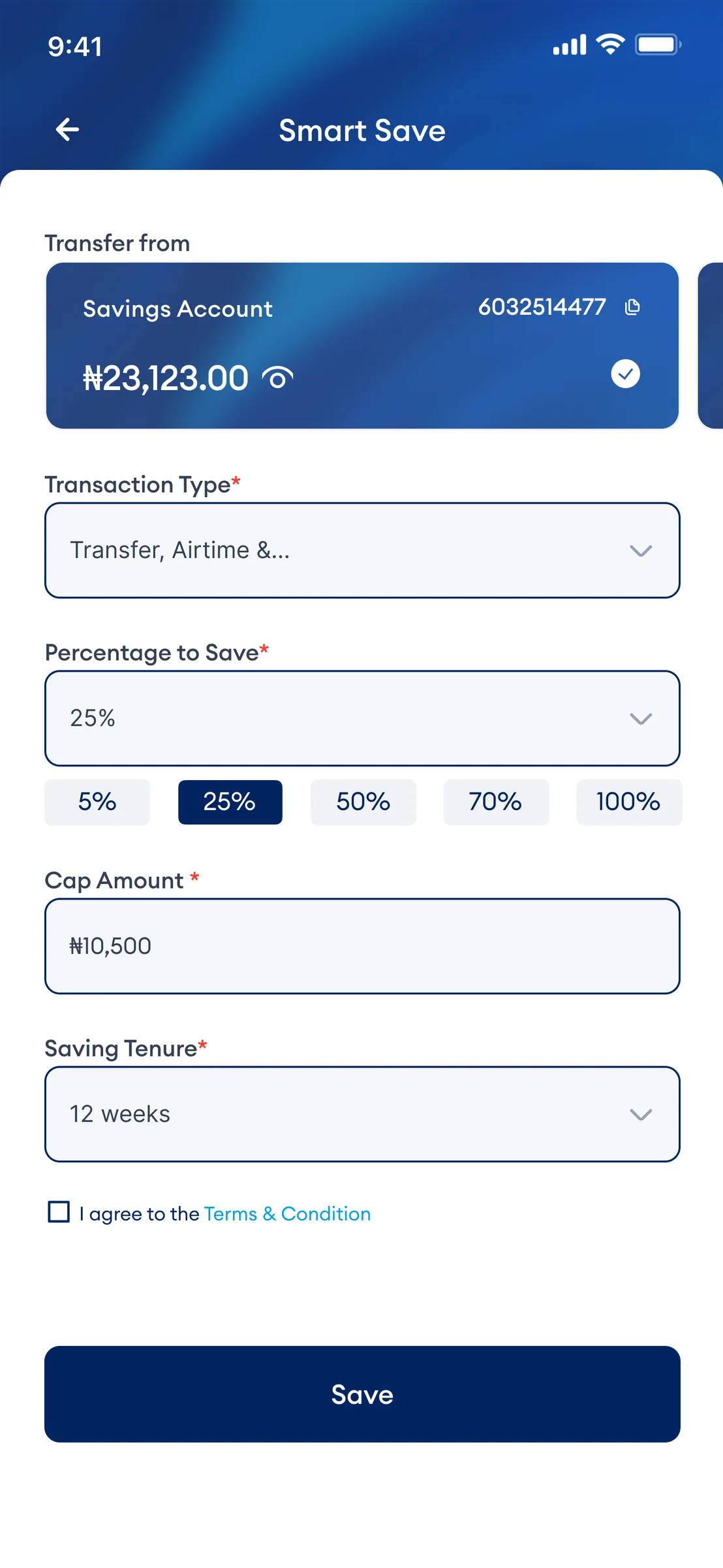
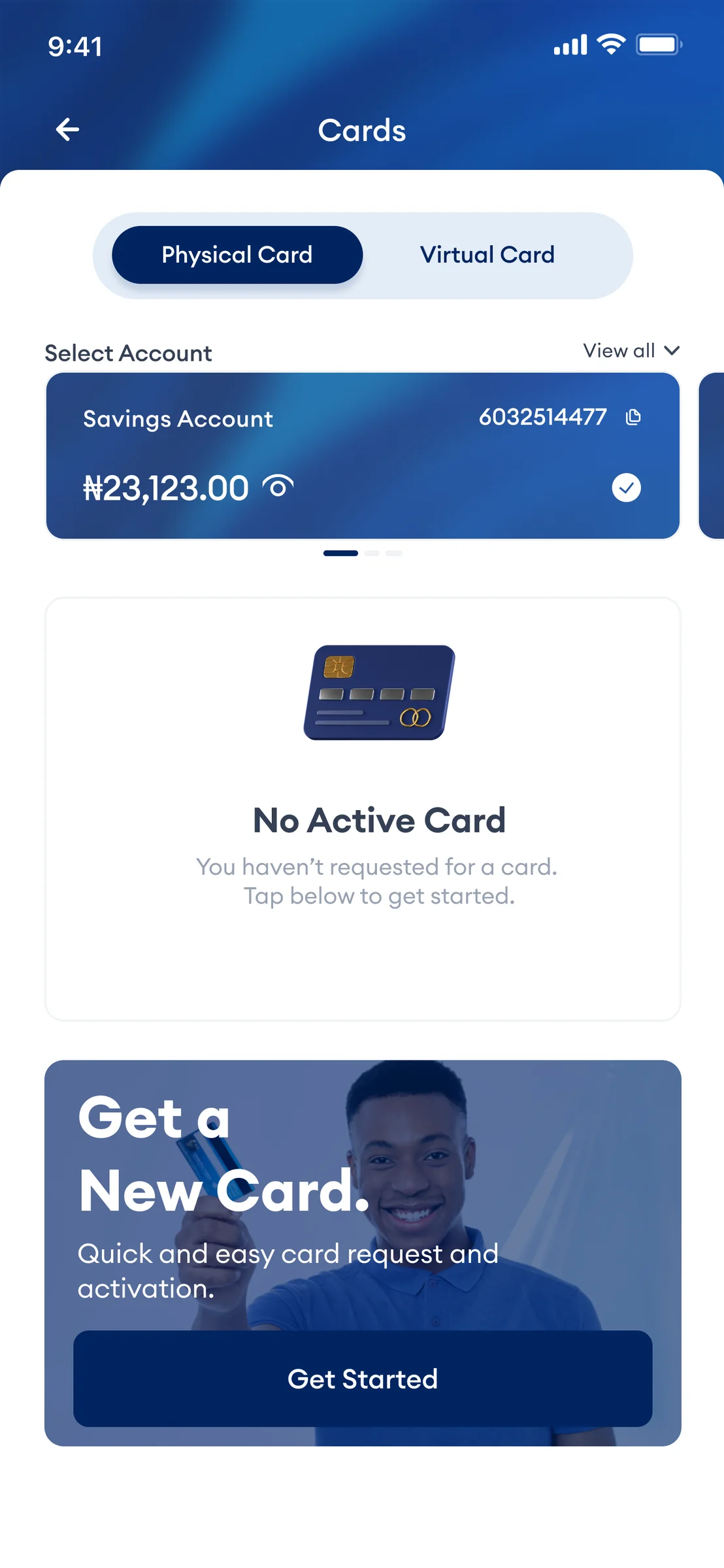
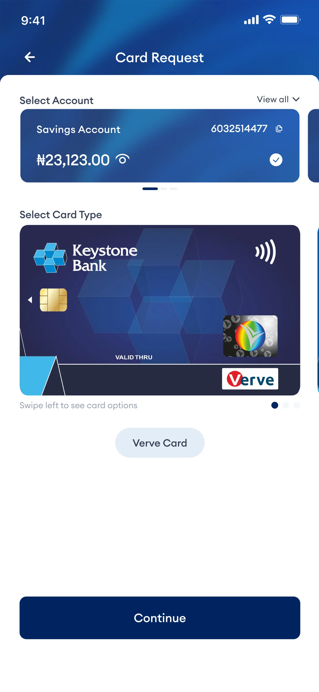
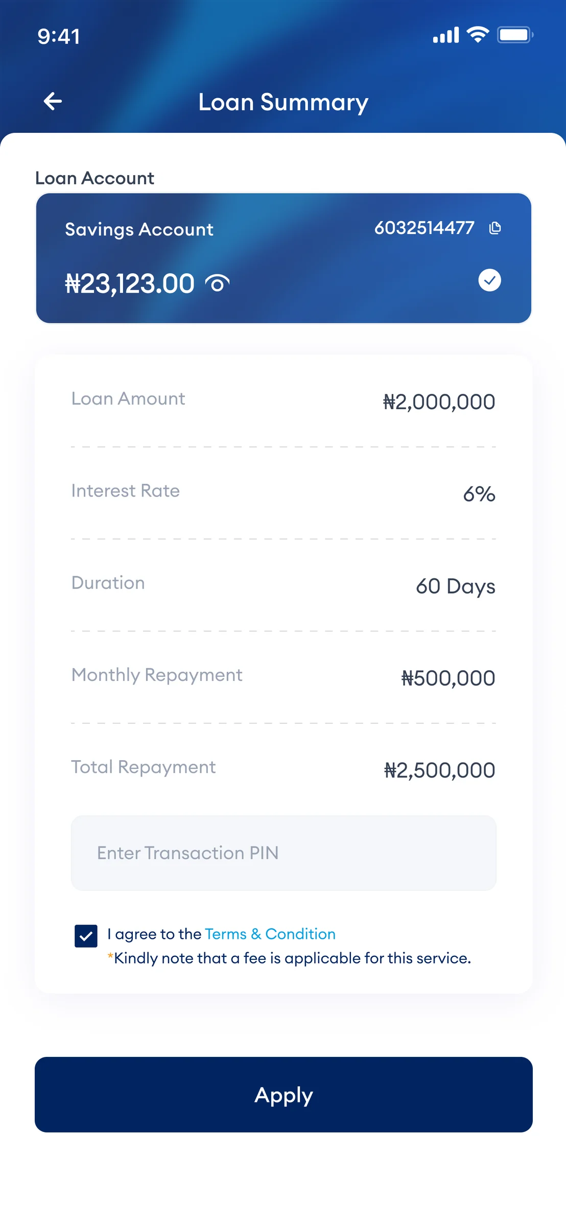
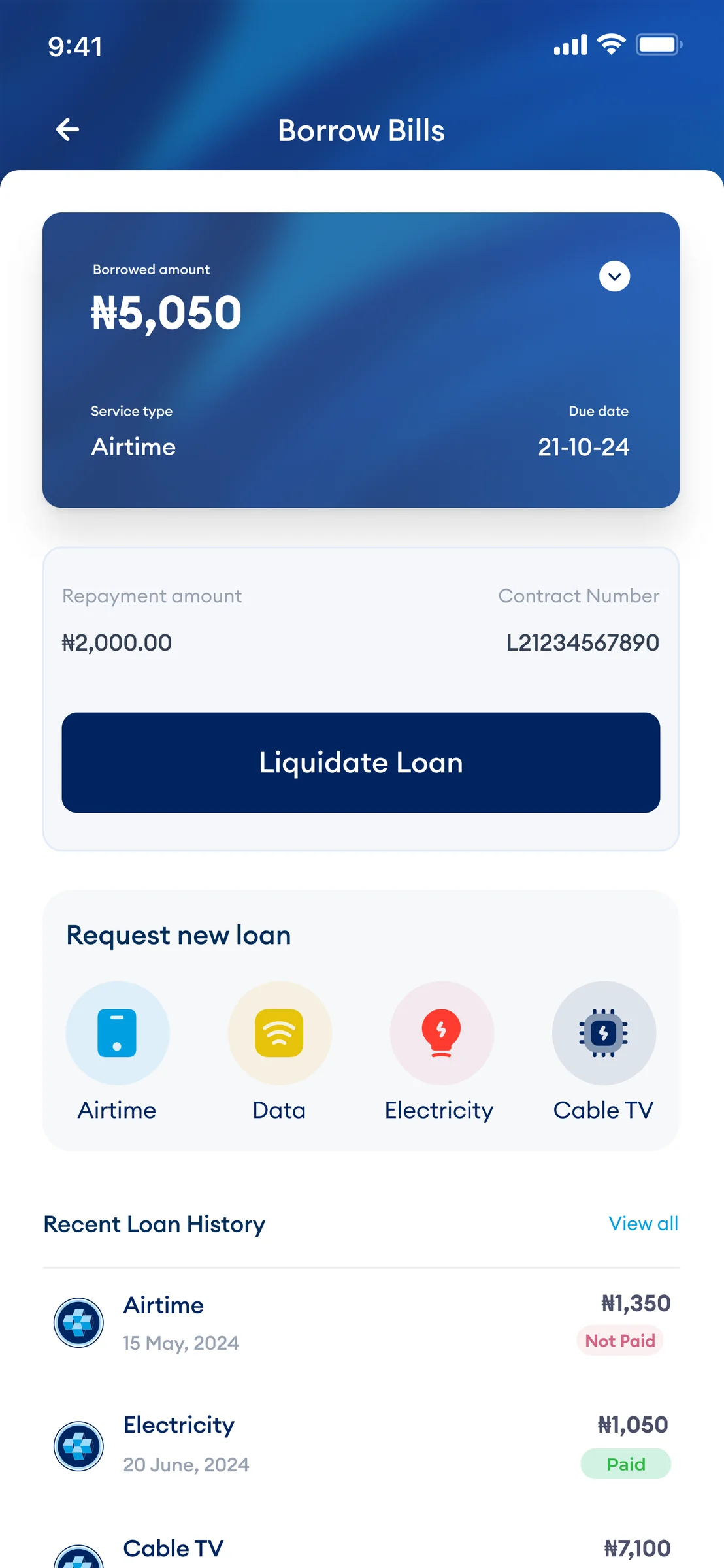
Savings, cards, loans and payments use a consistent visual language even when the underlying tasks are different.
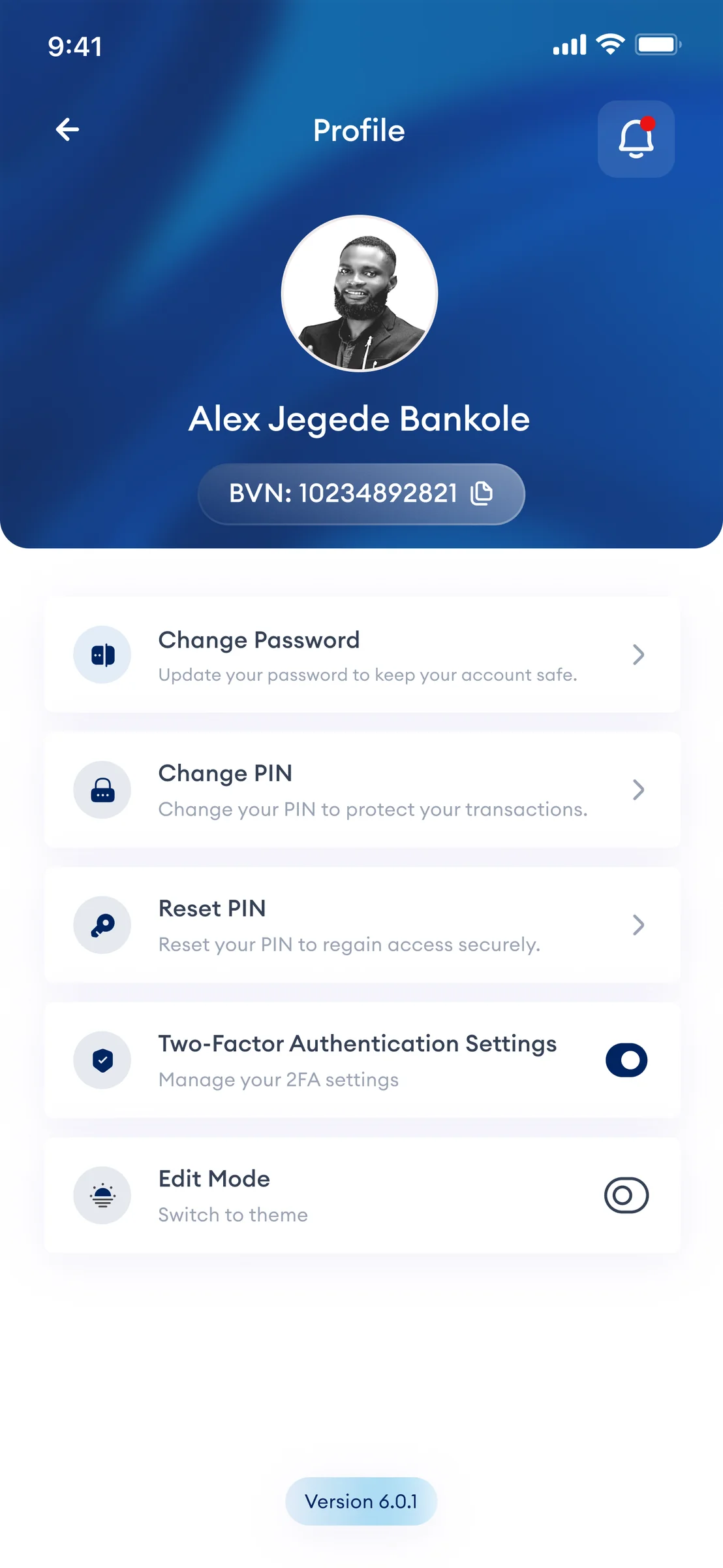
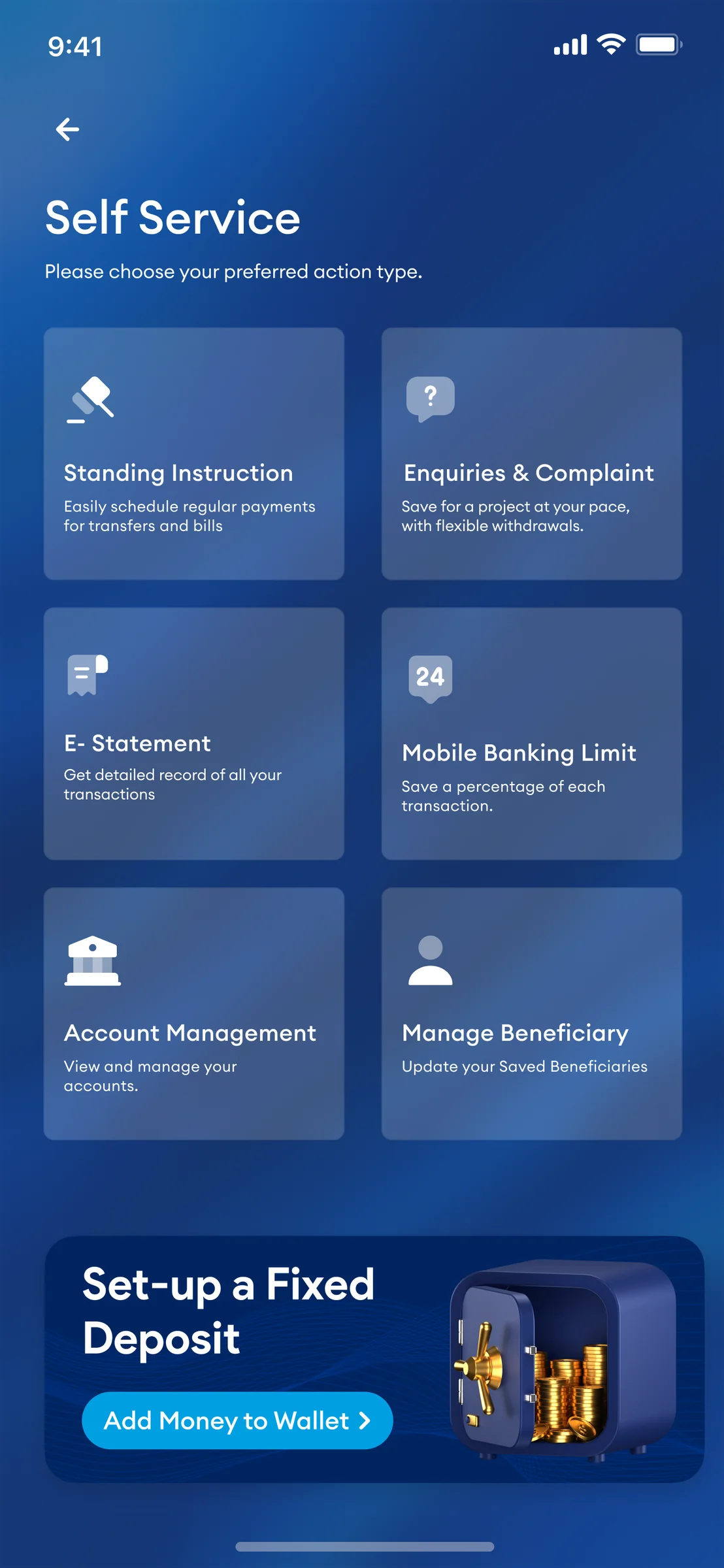
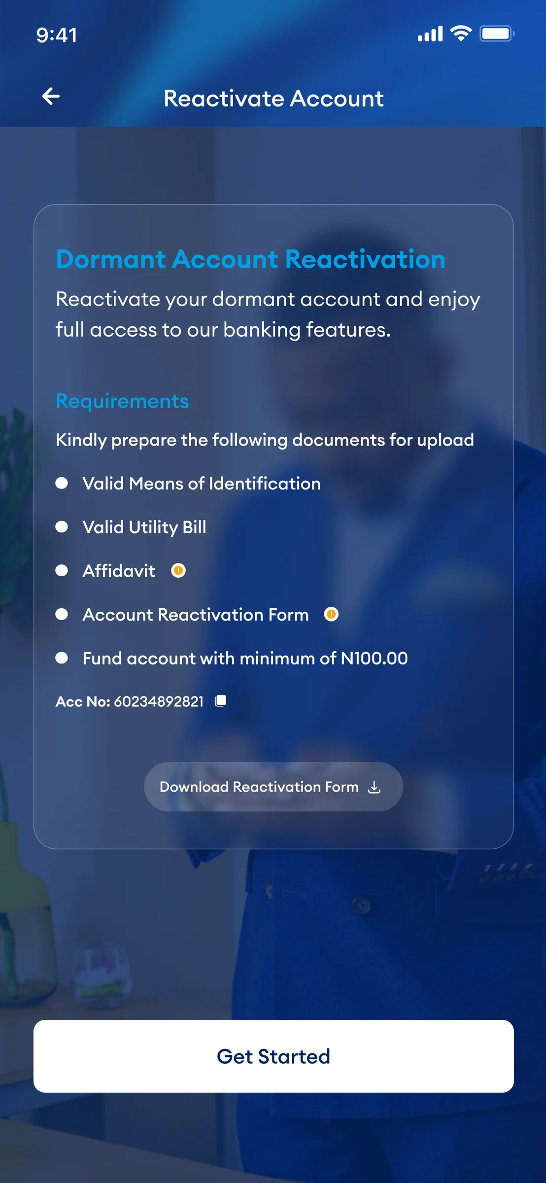
Self-service and account-management screens show that the experience also needs to work when something goes wrong or needs attention.
Inside the work
Selected screens from the supplied KeyMobile design set. The arrangement follows the product story: home → money movement → payments → money management → cards → self-service.
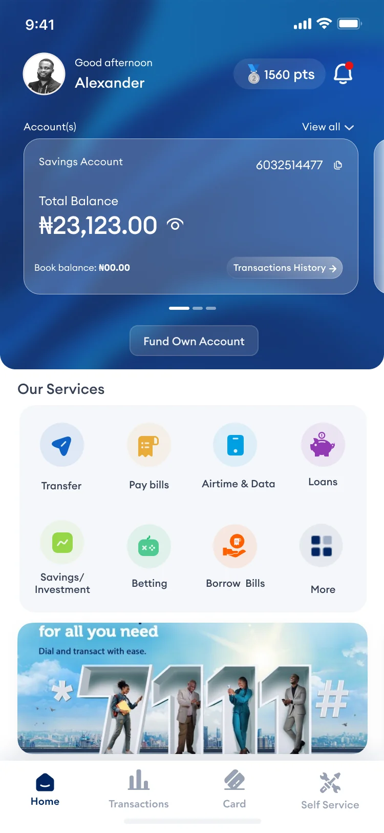
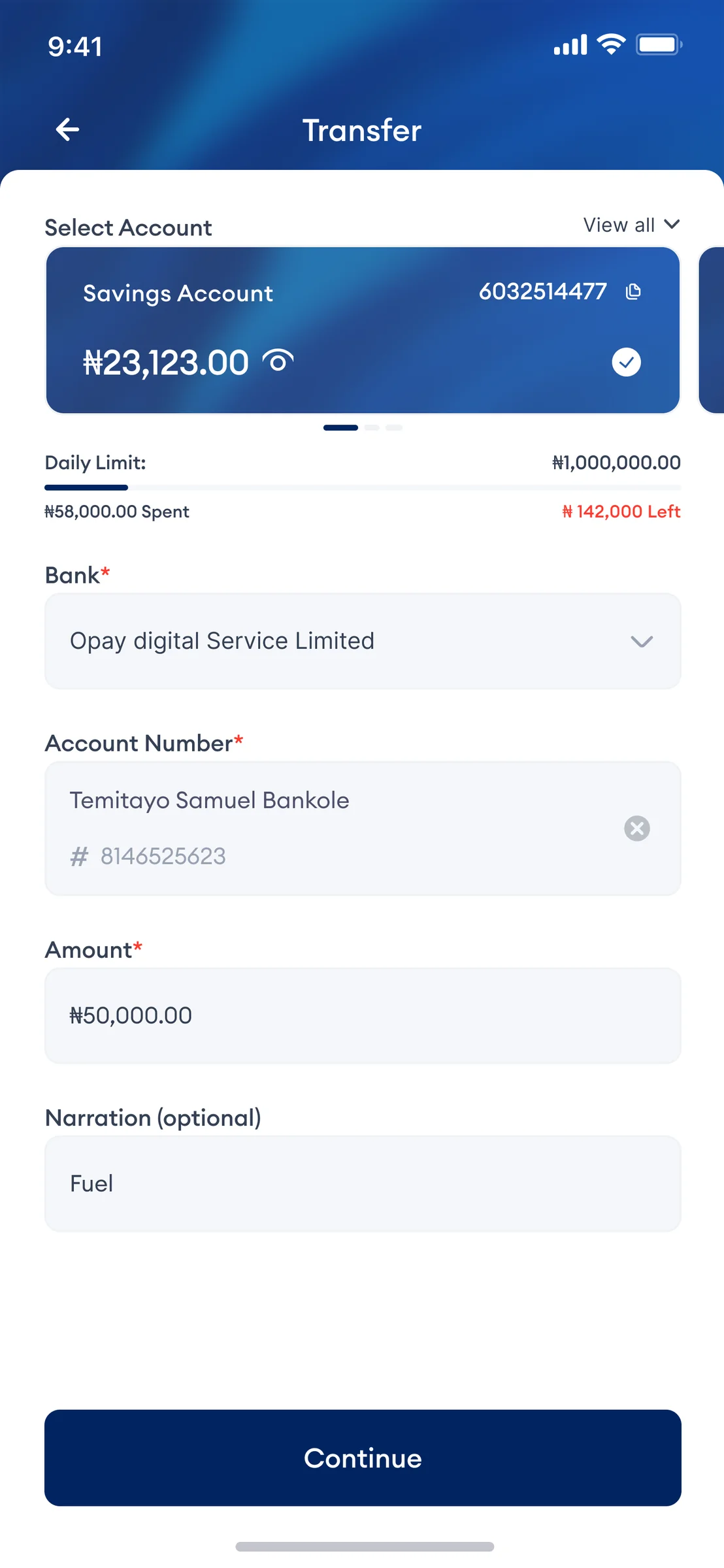
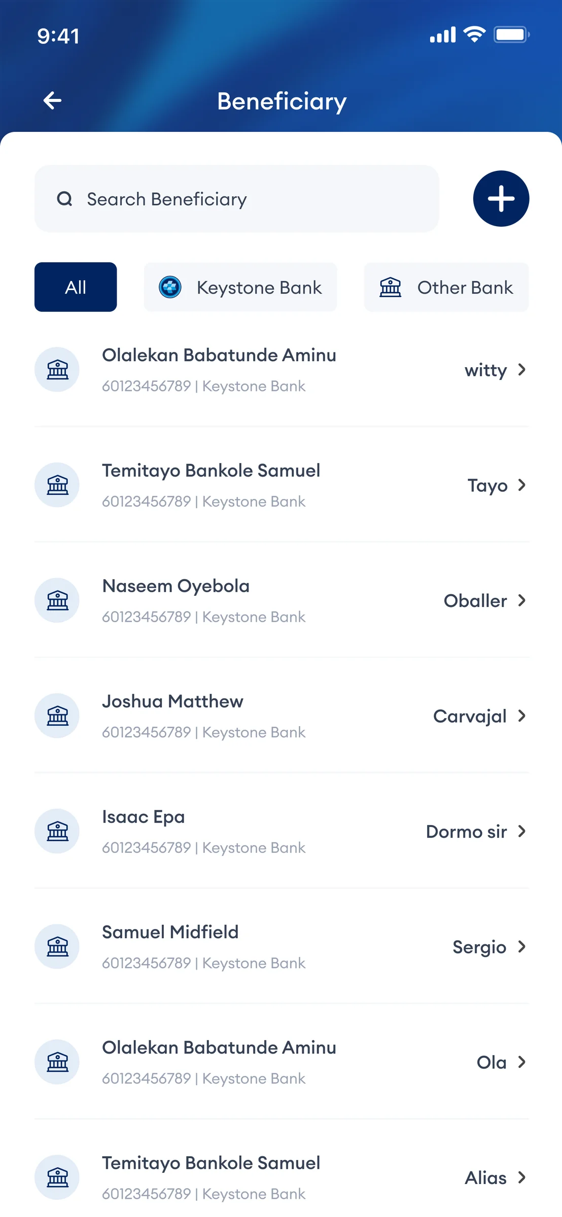

A more coherent design language across a complex product.
The work brought a broad set of banking journeys into a more consistent interface system: clearer task hierarchy, repeated patterns across related flows, and high-fidelity screens that could be discussed and handed off across product and engineering.
Rather than measuring success through a made-up headline metric, the strongest evidence in the supplied work is the breadth and consistency of the resulting journeys — from transfers and payments to savings, cards, loans and self-service.
Patterns were considered across journeys, not screen by screen.
Task-heavy experiences were structured around understandable next steps.
The work spans core banking and supporting customer-service journeys.
Product thinking beyond the pixels.
KeyMobile is a useful example of designing in a regulated, feature-rich environment where the challenge is not a lack of functionality — it is making functionality understandable.